
Add basic button functionality
Tutorial
Beginner
+10XP
30 mins
(186)
Unity Technologies
A button is the simplest and most common interactive UI element. Without buttons, you couldn’t get very far. In this tutorial, you will make your buttons functional using Unity’s Event System.
By the end of this tutorial, you'll be able to:
- Understand the role of the EventSystem GameObject in developing interactive UIs.
- Identify use cases for buttons in various UIs.
- Implement simple button functionality by using the Event System.
Languages available:
1. Overview
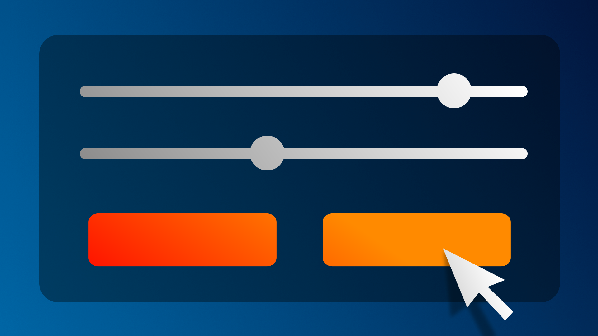
As you learned in a previous tutorial, a user interface is something that allows a user to interact (interface) with a computer or computer application. In many cases, those interactions involve clicking buttons, toggling checkboxes, or dragging sliders.
You interact with these types of UIs all the time. The keyboard on your phone is made entirely of buttons. Search filters for flights or restaurants use checkboxes and toggles. Computer volume and screen brightness settings are usually sliders.
In this tutorial, you will add the first bit of interactivity to your project, allowing the user to get to the settings menu and then back to the title screen.
2. Analyze some familiar UIs
A well-designed UI clearly communicates with the user. The user should know what they can and cannot interact with on the screen. If they do try to interact with something, they should know whether or not they were successful. In other words, the UI should provide the user with lots of feedback.
Check this out for yourself in Unity or in any other application on your computer:
- Hover your mouse over a button. What happens?
- Select a button. What happens?
- When an object is selected, how do you know?
Check your work
As you hover over interactable objects, they tend to become highlighted in a different color – often a shade of gray. The text might also change color instead of the background. This effect is often pretty subtle. If the button is already a light color, it usually gets darker.
If the button is already a dark color, it usually gets lighter.
When you actually click or select a button, it tends to change color again, usually in a more noticeable way. This often involves color rather than just shades of gray.
Navigate around other applications on your computer or your mobile device, hovering over and selecting various buttons, and notice how UIs communicate through color.
3. Edit your button transition colors
Unity allows you to control the color feedback provided by your buttons to better communicate with the user.
1. With the Settings Button GameObject selected, locate the Transition property in the Button component. This property should be set by default to Color Tint.
We will use Color Tint, which can change the color of the button when the user interacts with it. But, it is possible to swap out the image on interactions using the Sprite Swap setting or play custom button animations with the Animation setting.
Below are the default tint colors:
- The Normal Color is pure white. This means the button won’t have any color tint in its normal state.
- The Highlighted Color is an extremely subtle shade of grey, just a bit darker than white. This appears when the user hovers over the button.
- The Pressed Color is a more noticeable gray color.
- The Selected Color is not relevant in this use case, since the entire button will disappear after being clicked.
- The Disabled Color is not relevant either, since the button will always be enabled.
- The Color Multiplier property will increase the effect that the color tint has on your button. If you have a darker button or a semi-transparent one, this may be helpful.
2. Run your application and see the effect of the tint colors on your button. During playmode, experiment with different colors to see what they look like.
Note: It may be difficult to perceive the color changes if your button is dark or semi-transparent. In this case, try increasing the Color Multiplier to see a more dramatic effect. You can also choose to highlight the text of the button rather than the button image itself by changing the Target Graphic property to the child text object.
3. Edit the Highlight Color, Pressed Color, and Color Multiplier properties for the settings and exit button in your application. The pressed tint should probably be more noticeable than the highlight tint.
4. Add an action to the On Click event
With the button now looking the way you want, let’s make it functional. The users need a way to navigate between the main title screen and the settings menu.
When the user clicks the settings button, the settings menu should appear.
When the user clicks the exit button of the settings menu, they should be brought back to the title screen.
Let’s start by making the settings button bring up the settings menu.
1. In the Hierarchy, activate the Title Text and Settings Button GameObjects, then deactivate the Settings Menu GameObject. You can do this using the checkbox next to the GameObject’s name in the Inspector.
The settings menu should now be hidden.
2. Select the Settings Button and locate the On Click () section within the Button component.
Inside the On Click box, you will notice that it says List is Empty. This means that when the button is selected (on click), nothing will happen.
On Click is what’s known as a UnityEvent. UnityEvents can trigger any number of actions if that specific event occurs. In this case, the “Event” is someone clicking on the button.
3. Select the + button to add a new action to the list within the On Click event.
By default, the action you add is empty. It won’t do anything yet. We’ll make it do something next.
5. Make the settings menu appear on button click
Selecting a function for a UnityEvent is a two step process:
- Select which object you want to run the function.
- Select the function you want to run from that object’s components.
By default, there is nothing assigned to the Object field (where it says None (Object)). Since you want the Settings Menu to appear, that’s the object you want assigned to that field.
1. Click and drag the Settings Menu GameObject from the Hierarchy onto the empty Object field to assign it.
You’ll notice that the No Function dropdown has now become available. No Function means that no function – or action – has been selected to run from this object yet. You now have to select which function you want the Settings Menu object to run when this event occurs.
2. From the dropdown that is currently set to No Function, select GameObject > SetActive (bool). When you navigate this menu, you are browsing through the scripts assigned to this object and then through the functions available in those scripts.
By selecting GameObject > SetActive (bool) - you are choosing to run the SetActive function from the GameObject script.
With the function now assigned, you will notice a subtle checkbox has appeared beneath the function dropdown.
The checkbox appears because the SetActive (bool) function requires a Boolean (or true/false) parameter.
You need to choose whether you want to call SetActive(true), which would activate the GameObject, or SetActive(false), which would deactivate it.
Since you want the Settings Menu to appear OnClick, you should use true.
3. Use the checkbox to call SetActive(true) and activate the Settings Menu.
Try testing your app. If you select the settings button, the settings menu will appear on screen right on top of your title. Don’t worry – we’ll fix that next.
6. Make the title screen elements disappear
When you select the settings button, the settings menu should appear. But the title and settings button should also disappear.
You already know how to make an object appear. Making objects disappear is the same, except the SetActive Boolean should be set to false instead of true.
1. With the Settings Button GameObject still selected, use the + button to add two new actions in the On Click event.
2. Assign the Title Text object to one action and the Settings Button object to the other by dragging them from the Hierarchy.
3. Use the function dropdown to select GameObject > SetActive, then make sure the checkbox is disabled. This will call SetActive(false), making those objects disappear.
Now when you select the settings button, the menu should appear and the other elements should disappear.
7. Navigate back to the title screen
Navigation to the settings menu is complete. Next, the user needs to be able to navigate from the settings menu back to the title screen.
When the exit button on the settings menu is selected, the settings menu should disappear and the title screen elements should reappear:
1. Select the Exit Button GameObject and add three new empty actions to the On Click event.
2. Assign the Settings Menu, the Title Text, and the Settings Button GameObjects to the empty Object fields by dragging them from the Hierarchy.
3. Use the function dropdowns and the Boolean checkboxes to deactivate the Settings Menu GameObject, but activate the Title Text and Settings Button GameObjects.
Navigation to and from the settings menu should now be fully functional, showing and hiding elements as expected.
8. Next steps
In this tutorial, you implemented basic button functionality in order to make GameObjects appear and disappear. You used this functionality to allow the user to navigate to and from the empty settings menu. The only thing left to do now is actually add some settings to that settings menu!
In the next tutorial, you will use more complex UI elements like the toggle and slider to add some settings to your settings menu.