
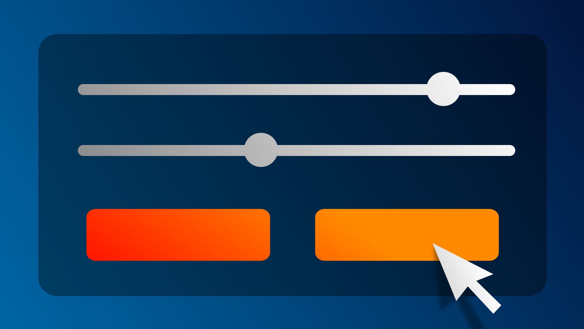
Create a menu background with images
Tutorial
Beginner
+10XP
25 mins
(174)
Unity Technologies
Images are critical in the design of UIs, from simple backgrounds and icons to more complex heads up displays and dashboards. In this tutorial, you will add custom images for your settings menu background and button, making sure they still look good if they’re stretched in different directions.
By the end of this tutorial, you'll be able to:
- Add Image elements.
- Apply and configure UI sprites.
- Apply and configure materials to an Image component.
Languages available:
1. Overview
In the previous tutorials, you worked with text and button elements. Another major element in UI design is Images. Images can be used for backgrounds, icons, badges, and more.
In this tutorial, you will add a new background image for your settings screen, replace your default button images with custom ones, and use a technique called 9-slicing to make sure the images scale appropriately.
2. Add a basic settings background
The settings menu elements will sit on top of a simple rectangle. To create that rectangle, you’ll need to add an Image object.
1. First, clear your Canvas by deactivating the Title Text and Settings Button GameObjects. This will give you a blank slate to work from.
2. In the Hierarchy, right-click > UI > Image, then rename it “Settings Menu”. An Image is a very simple UI element that can display any image you have imported into your project. By default, this will add a white square in the center of your scene.
3. In Scene view, use the Rect Tool to reposition and resize the image so that it’s appropriate for a settings menu.
4. In the Image component, select the use the color picker to change the color of the background. From the Color window, you can also use the Alpha property (A) to make the background semi-transparent.
3. Add a “Settings” title
1. In the Hierarchy, right-click on the Settings Menu GameObject and select UI > Text - TextMeshPro.
By default, this will anchor the New Text object to the center of the background object, since the background is its parent object
2. Rename the Text (TMP) GameObject as “Settings Text”, then edit the properties in the TextMeshPro - Text (UI) component so the text looks good.
Your settings menu should now be looking pretty good – the last remaining touch is a custom Exit button to return to the Title.
4. Create a simple exit button
You have a settings button to take you to the settings screen. Now you need an exit button to get back to the title screen. As you create this button, we’ll look more in depth at the ways that you can customize the design of UI elements using the Image component.
1. In the Hierarchy, right-click on the Settings Menu GameObject and select UI > Button - TextMeshPro. This will create a new Button child object, which you can rename “Exit Button”.
By default, your button will appear with the word Button on it, using the default font.
2. Expand the Exit Button object and select the child Text object. Change the text to say “X” in your desired font. The “X” will serve as a symbol for close or exit.
Of course, the exit button is not in the ideal shape or location yet.
3. Use either the Rect tool in Scene view or the properties in the Rect Transform component to make the exit button a perfect square in the upper-right corner of the UI background.
You are free to place this exit button anywhere you like, but keep in mind that users are accustomed to seeing this kind of button in the upper-right or upper-left corner – and one of the goals of UI design is to make it intuitive.
5. Choose a 9-sliced sprite
It’s now time to choose a nicer Sprite for your button’s Image component. A sprite is a type of texture in Unity that has been configured for 2D use, including UI.
Normally, when you scale a sprite horizontally or vertically, it becomes distorted.
For example, let’s say you wanted to use the sprite below for your settings background:
If you scaled this sprite to have more of a portrait orientation, it would look squished and distorted, as shown below.
However, when you resized the exit button , changing it from a rectangle to a square, the sprite did not get squished or distorted. How is this possible?
1. With the button selected, locate the Image Preview window at the bottom of the Inspector. You may have to expand the window to see the image.
Notice the 3x3 grid on the image preview, separating the image into nine sections. This is a technique known as 9-slicing, which allows you to scale rectangular sprites without stretching them out of proportion.
This is achieved by leaving the corners unstretched, but scaling all other sides as necessary.
Here’s an example of a button and how it would look scaled horizontally with and without this technique:
You can read more about 9-slicing in the Manual.
This is the default 9-sliced button image that Unity provides, but you can of course replace this –or any of your other UI sprites – with custom 9-sliced images.
2. In the Image component, use the object picker (⊙) button to browse through some other UI sprites we’ve provided for you. Choose the one that you think looks best for your settings menu.
Using the Sprite Editor to slice your UI sprites
Images will not be 9-sliced by default, but you can slice your own sprites using the Sprite Editor.
To see this for yourself, navigate to CreativeCore_UI > UI > Textures, then select one of the UI textures. If an image has its Texture Type set to Sprite, you can select Open Sprite Editor to open the editor in a new window.
Note: You may be prompted to install the 2D Sprite package first, then you’ll be able to select Open Sprite Editor.
Using the Sprite Editor, you can position and apply the slices so that your UI sprites will scale perfectly.
Once your sprite is 9-sliced, you just need to set its Image Type to Sliced in the Image component, and it should scale nicely.
6. Explore: Continue customizing your UI
You know how to add and swap images in the UI. Apply these skills to make your UI elements look even better. You could have the settings button use a custom image instead of the default one, or you could add borders around the background to make it stand out more.
As you layer more details onto your UI elements, it’s important to understand the Draw Order of the Canvas. Objects are drawn onto the screen in the order they are listed in the Hierarchy. This means that objects lower down in the Hierarchy will be drawn on top of objects that are higher up.
If objects are not ordered properly in the Hierarchy, you may end up with overlapping objects, like the one shown below.
To fix this, you just need to put that exit button below the background border in the Hierarchy.
7. Next steps
Your title screen and settings menu look fantastic. However, there is still no interactivity in the UI! There’s no way to navigate to and from the settings menu and there are no actual settings in the menu itself. You will add all of that interactivity in the next tutorial.