
Creating UI Buttons
Tutorial
Beginner
+10XP
15m
(983)
Unity Technologies
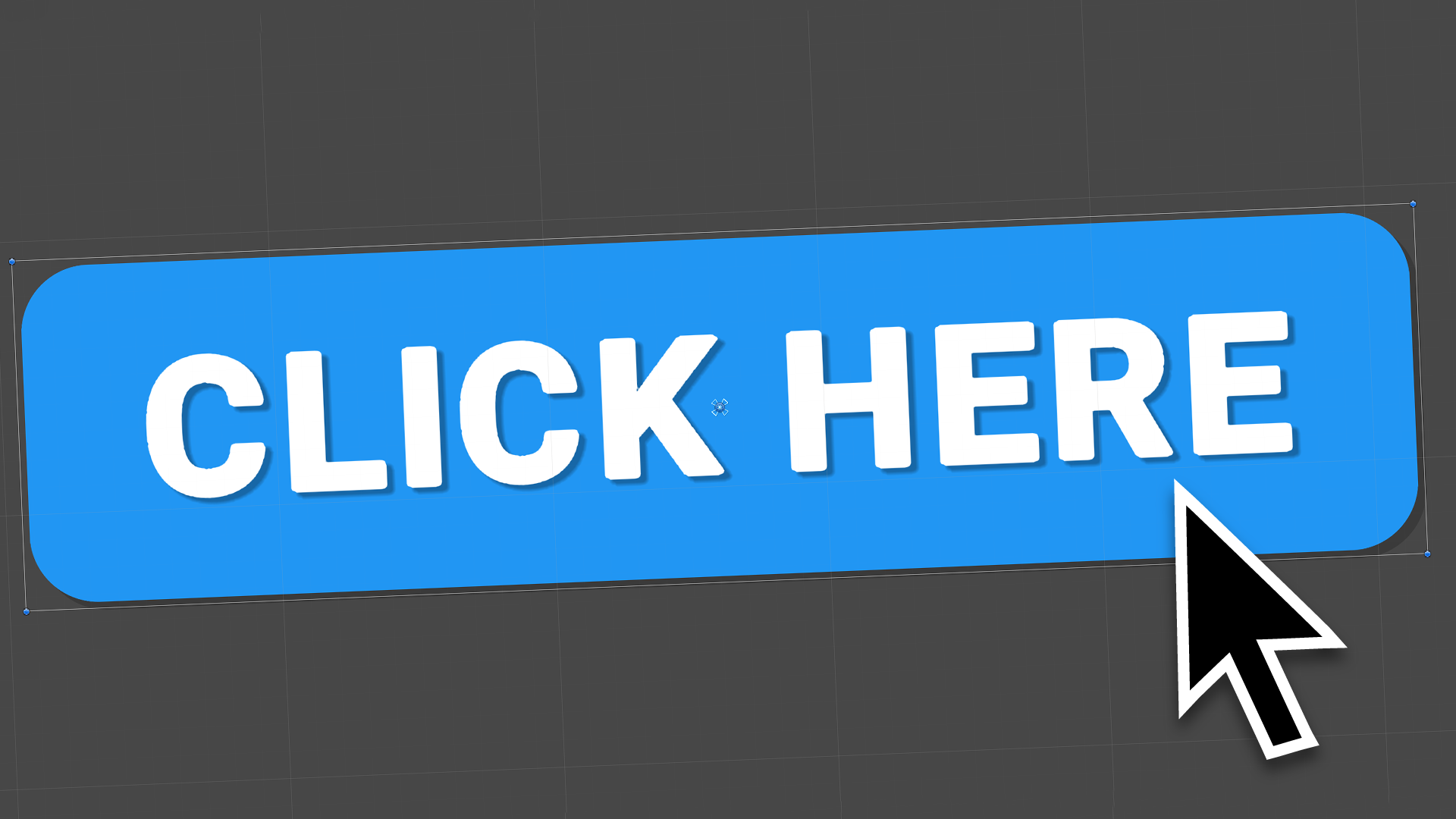
Buttons are one of the most commonly used UI components. They are very easy to customize and quick to configure to complement any art style to match an application. In this tutorial, you will learn to create UI buttons.
Languages available:
1. Creating UI Buttons
This tutorial has been verified using Unity 2019.4.10f1 LTS.
Buttons are one of the most commonly used UI components. They are very easy to customize and quick to configure to complement any art style to match an application. Buttons feature publicly exposed On Click functions that allow interactions to be performed without any actual scripting involved. Buttons make calling on custom functionality simple as well.
1. If a Canvas is already present in the Hierarchy, right-click the Canvas and select
UI > Button. If a Canvas is not present in the Scene, it will be automatically created and set as a parent of the Button (Figure 01).
A Button consists of two components: the Button itself, and a child Text component. By default, the text component is standard Unity UI text; however, TextMesh Pro text can now be used for UI components. TextMesh Pro gives designers far more options to work with when creating text for their applications.
2. From the Windows dropdown, select Package Manager.
3. On the upper-left side of the Package Manager window, click the All button.
4. Select the TextMesh Pro package from the list on the left, and click Install on the upper-right side.
5. After the Package Manager has refreshed, you should see TextMesh Pro in the In Project tab. Close the Package Manager window.
6. Click on the Button pivot to show the child Text component (Figure 02).
7. Delete the Text component.
8. Right-click the button and select UI > TextMesh Pro Text.
9. A new Text component will appear as a child of the Button. This text will appear white, so it might be slightly difficult to see.
10. Adjust the yellow bounding box to match the shape of the Button (Figure 03).
11. In the Inspector, configure the Button text as needed. Text may be changed in the Text Input Box. TextMesh Pro provides text editing features that are similar to many other art or layout programs (Figure 04).
On the Button object itself, the two most important components are Image and Button. The Source Image serves as the Button’s background image. By default, it is set to the UISprite asset, which is included with Unity. A color overlay can be added to change the Button’s tint. Optionally, a material may be added — but note that it must use a UI Shader; otherwise, it will appear black in the game view (Figure 05).
The Button component controls the functionality of the button it’s attached to. The top half of the component focuses on the Button transition, or how it responds when it’s interacted with. By default, this Transition is set to Color Tints, but it can be set to Sprite Swap or Animation. Sprite Swap will change the actual background image of the Button as it’s interacted with, while Animation will allow different animations to play depending on what the Button is doing. The Transition can also be set to None, but it is advisable to at least keep the default Color Tint transition, as this gives the user a visual cue that they successfully clicked the Button. Should the Button need to be disabled for any reason, uncheck the Interactable checkbox above Transition (Figure 06).
The bottom section of the Button Script is dedicated to creating On Click() interactions.
12. Click the + button at the bottom of the On Click() section. This will create a new action (Figure 07).
13. In the None (Object) slot, drag in the object that you would like to have affected by the Button. Alternatively, drag in the object that has the associated script that should run when the Button is pressed.
14. Once an object is in the Object slot, the Function dropdown will become available. From it, select the object properties or script that contain the function you wish to run.
2. Conclusion
In this tutorial, you learned how to create UI buttons. You also learned how to add in TextMesh Pro from the package manager in order to get a crisp and clean text on your buttons. With this knowledge, you can now apply it to any project moving forward and go from plain to wonderfully beautiful UI buttons that fit with the design of your project.