
Customizing the UI layout
Tutorial
intermediate
+10XP
20 mins
(11)
Unity Technologies
In this tutorial, you will further explore the structure of the Reflect Prefab to better understand how you can customize it to fit your needs.
Languages available:
1. Introduction
In this tutorial, you are going to change the Reflect Viewer interface to further align with the brand of the fictional UniArch company. The company primarily uses red as its brand color and would like to see this in the Reflect Viewer. The Assets you will use in the tutorial are provided in the downloadable exercise files.
2. Customizing the Viewer Canvas to Reflect Brand Colors
Preparing the Assets
1. Start by downloading and then importing all the images you want to use in your Scene. You wIll find the colored icons for this tutorial in the exercise files.
2. Create a new folder called Images in the Scene Assets folder. Drag the images into the Scene and place them in this folder.
From here, you will start customizing the Reflect Viewer interface to reflect UnityArch’s red brand color.
3. Select the top image and then, while holding Shift, select the bottom image to select everything (Figure 01).
4. In the properties Inspector, change the Texture type to Sprite (2D and UI).
5. Once the imported images are turned into Sprites, they can be used to replace the icons in the Reflect Viewer Prefab.
3. Customization
You do not have to customize every element in the Scene for this tutorial. In the following step, you will be presented with the path of all the elements on the canvas that you can change to suit your needs, but that is meant to show you the possibilities.
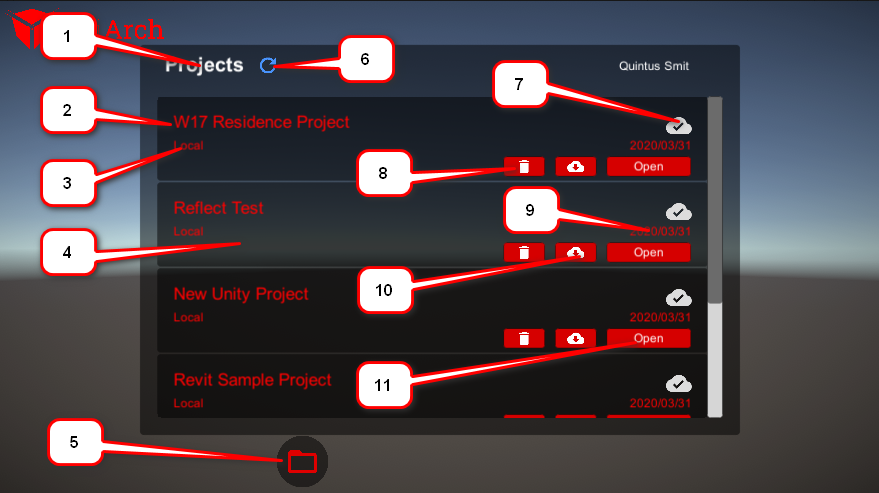
4. The Projects Canvas
The Projects canvas is the first canvas you will see when opening the Reflect Viewer. This panel allows you to select the project you wish to open and has numerous elements on it that can be customized. Below, you will find a list of all the elements with the equivalent numbers underneath showing the path you would follow in the Scene explorer to find the Prefab that needs to be edited (Figure 02).
On the Projects Canvas, the following elements can be customized:
1. UI > Window > Title > Text: You can set color in the Property Inspector once the Text is selected (Figure 03).
2. UI > Window > ListControl > Viewport > Content > ItemTemplate > Title: You can change the color properties in the Inspector (Figure 04).
3. UI > Window > ListControl > Viewport > Content > ItemTemplate > Description: You can change the color properties in the Inspector.
4. UI > Window > ListControl > Viewport > Content > ItemTemplate: You can change the color properties in the Inspector.
5. Button: You can change the Source Image in the Inspector.
6. UI > Window > Title > Refresh > Icon: You can change the Source Image in the Inspector.
7. UI > Window > ListControl > Viewport > Content > ItemTemplate > ConnexionStatus > Connected/Not Connected: You can change the Source Image in the Inspector.
8. UI > Window > ListControl > Viewport > Content > ItemTemplate > DeleteButton: You can change the Source Image in the Inspector.
9. UI > Window > ListControl > Viewport > Content > ItemTemplate > Date: You can change the color in the Inspector panel.
10. UI > Window > ListControl > Viewport > Content > ItemTemplate > DownloadButton: You can change the Source Image in the Inspector.
11. UI > Window > ListControl > Viewport > Content > ItemTemplate > OpenButton: You can change the color on the Button Script in the Inspector panel.
5. The Main Window
The main window is the screen you will see after opening a project. There are five elements on this screen that you can customize (Figure 05).
The following paths show you where to find the highlighted elements in the Prefab, should you wish to customize them.
1. Reflect > Canvas > Project Canvas > Button: You can change the Source Image in the Inspector panel.
2. Reflect > Canvas > ARMode Canvas > Button: You can change the Source Image in the Inspector panel.
3. Reflect > Canvas > Sync Canvas > Button: You can change the Source Image in the Inspector panel.
4. Reflect > Canvas > Metadata Canvas > Button: You can change the Source Image in the Inspector panel.
5. Reflect > Canvas > Settings Canvas > Button: You can change the Source Image in the Inspector panel.
6. The Settings Pop-up Menu
The settings pop-up menu (Figure 06) can also be customized, but the approach is different. This menu is controlled via a script and can only be manipulated by replacing the original image in the package or changing the script. Scripting is beyond the scope of this tutorial and therefore will not be covered.
The image settings for both of these (1 and 2) icons can be found in the Reflect Prefab under Canvas > Settings Canvas > UI > ButtonListControl > ListControlItem > Image
7. The Metadata Menu
The metadata menu (Figure 07) opens up when the filter menu is selected. This menu will allow you to highlight elements in the Scene or isolate them based on Category, Manufacturer, Type, System, or Family.
The following paths show you where to find the highlighted elements in the Prefab, should you wish to customize them.
1. Reflect > Canvas > Metadata Canvas > MenuTemplate > Title > Text: You can change the color in the Inspector Panel.
2. Reflect > Canvas > Metadata Canvas > MenuTemplate > MenuItemTemplate > Button > VisibleButton: You can change the Source Image in the Inspector panel.
3. Reflect > Canvas > Metadata Canvas > MenuTemplate > MenuItemTemplate > Button > InvisibleButton: You can change the Source Image in the Inspector panel.
4. Reflect > Canvas > Metadata Canvas > MenuTemplate > MenuItemTemplate > Button > Text: You can change the color in the Inspector panel.
5. Reflect > Canvas > Metadata Canvas > MenuTemplate: You can change the color of the Source Image in the Inspector panel.
8. Next Steps
By the end of this tutorial, you should have a firm grasp of the structure of the Reflect Viewer Prefab canvas and how to customize it. The extent of customization is up to you.