
UI Components
Tutorial
Beginner
+0XP
1h 15m
(586)
Unity Technologies
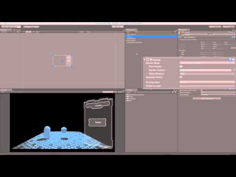
This tutorial covers User Interface (UI) Components available in Unity, including Canvas, Button, Image, Text, Slider, and more.
Languages available:
1. UI Button
What are UI Buttons made of and how do they function?
2. UI Image
The UI Image component is the main graphic element of the UI system in Unity, and is used for everything from button and panel backgrounds to slider handles and speedometers!
3. UI Text
The Text component, used to render text onscreen for various purposes such as labels, buttons, and other information.
4. UI Events and Event Triggers
In Unity 4.6 we add the new Event System to trigger things in code from your UI. This tutorial is a quick overview of the system and how it works.
5. UI Slider
UI Sliders can be used for various purposes from settings menus to health bars.
6. UI Transitions
UI transitions are available to several different UI components, this tutorial explains how they work and what they can do.
7. UI ScrollRect
The Scroll Rect is a rect that can be scrolled horizontally or vertically to create masked spaces with hidden content in your UI.
8. UI Scrollbar
Scrollbars can be used to control scroll rects to navigate content in your UIs.
9. UI Mask
Masks are used to hide part of a UI Image element. They can be used to define an area to animate images into, or in conjunction with the Scroll Rect component to achieve a scrollable space.