
UI Toolkit - First steps
Tutorial
Beginner
+10XP
25m
(878)
Unity Technologies
In this example, you’re going to create a simple toolbar window with buttons to instantiate primitive objects in the Scene.
Languages available:
1. Prepare your project
Before you start, let's do some preparations.
- Open Unity and create a new project using any template.
- In the Assets folder, create a folder named Editor and inside it, a folder named Resources. You will place all your scripts inside the Assets/Editor folder and your other assets inside the Assets/Editor/Resources folder. For more information on the naming of the folders, click here.
Note: UIElements doesn't require using a Resources folder. We use one to better organize the project and simplify the loading of UI templates (UXML). - In the Editor folder, right-click and select Create > UI Toolkit > Editor Window.
- Download the icons attached in the materials section of this tutorial, create a folder named Icons inside the Editor/Resources folder.
Place all the icons inside the Assets/Editor/Resources/Icons folder.
2. Create your Editor window
Let’s now create your Editor window and add it to Unity's menu bar.
1. In UI Toolkit Editor Window Creator, enter QuickTool into the C# box, and disable UXML and USS.
Note: You can enable UXML and USS to automatically create the UI template and style sheet files. However, in this tutorial, you will learn how to manually create them in Unity.
2. Click Confirm. This creates a custom Editor window.
3. Let's change the window location in the menu bar and set a minimum size to the window. Open the QuickTool.cs script using your favorite code editor and replace the MenuItem and the ShowExample with the following:
public class QuickTool : EditorWindow
{
    [MenuItem("QuickTool/Open _%#T")]
    public static void ShowWindow()
    {
        // Opens the window, otherwise focuses it if it's already open.
        var window = GetWindow<QuickTool>();

        // Adds a title to the window.
        window.titleContent = new GUIContent("QuickTool");

        // Sets a minimum size to the window.
        window.minSize = new Vector2(280, 50);
    }
}
Note: The characters _%#T at the end of the MenuItem string lets us add a shortcut to open the window, which is CTRL + SHIFT + T (or Cmd + Shift + T on a Mac).
4. Save your code and go back to Unity. You should see a new item called “QuickTool” in the menu bar. Click it and click Open. Your window should open.
3. Create a basic UI using UXML
In UI Toolkit, user interfaces are composed of individual visual elements. Combinations of multiple visual elements are designed and stored in UI template files, with the extension “*.uxml”. A UXML file stores the hierarchy, the styling and the layout of all the visual elements it contains. A UI hierarchy of one or more visual elements is called a Visual Tree.
User interfaces are built up from one or more visual trees. A screen or panel holds a reference to a root VisualElement, called the rootVisualElement. Visual trees loaded from UI template files or created via script can be added to the root element, which will make them appear on the screen.
Each EditorWindow comes with a rootVisualElement for all the UI in it.
Create an element directly in C#
Before getting into UXML, let’s first see how to create a basic element in C#.
In the QuickTool class of the QuickTool.cs script, there is a CreateGUI() method. It contains a reference to the rootVisualElement of the window and adds a label to your window.
Note: For runtime UI, your MonoBehaviour script requires access to a UIDocument component, and retrieve the rootVisualElement from there.
You can add more elements into it. The code below adds a button control to the visual tree, and set its dimensions to 160 x 30 pixels.
private void CreateGUI()
{
    // Reference to the root of the window.
    var root = rootVisualElement;

    // Creates our button and sets its Text property.
    var myButton = new Button() { text = "My Button" };

    // Give it some style.
    myButton.style.width = 160;
    myButton.style.height = 30;

    // Adds it to the root.
    root.Add(myButton);
}
It’s that simple! If you save your code and go back to Unity, your window should now contain a button:
You could keep adding elements and styling them directly from a C# script, but as your UI becomes more complex, this becomes increasingly hard to manage. Unity recommends to separate the hierarchy of elements (using UXML) from their styling (using USS) and to use C# scripting to load UI templates as needed, and add behaviours, actions and bindings.
Delete (or comment out) all the code inside the CreateGUI() method and let’s jump into UXML!
Create UXML files
Now it’s time to create proper UI template files (UXML)!
An efficient way to build your layout is to create a UI template for a repeating element, and then instantiate this template multiple times inside another template file. You will create two templates:
- ButtonTemplate: contains a button with a VisualElement nested in it that will serve as its icon.
- QuickTool_Main: contains the main UI hierarchy that will be added to the rootVisualElement. It will instantiate the button template once for each of the five buttons in the toolbar, and arrange them in the hierarchy.
1. In Unity, navigate to your Assets/Editor/Resources folder in the Project View. From the main menu, choose Assets > Create > UI Toolkit > UI Document. This creates a new UXML template file inside the folder.
2. Name the file ButtonTemplate.
3. Repeat the process to create a second UXML file and name it QuickTool_Main.
Note: Double clicking on the UXML file in the Project View doesn't open the file in a text editor, but instead opens the UI Builder window. To open the file in a text editor, click the arrow next to the file, and then click inlineStyle.
Open the ButtonTemplate.uxml file in a text editor and replace its content with the code below:
<UXML xmlns="UnityEngine.UIElements">
  <!-- Creates the button. -->
  <VisualElement class="quicktool-button unity-button">
    <!-- Adds a VisualElement child (corresponding to the button's icon). -->
    <VisualElement class="quicktool-button-icon"/>
  </VisualElement>
</UXML>
The UXML code creates a button and a child element underneath it to hold the button’s icon. The button and the icon are also assigned class names in the UXML tags. These are used for two purposes later on:
- Access the elements from script
- Assign a style to the visual elements
5. Next, create the main hierarchy that uses the button template you just created. To do so, open the QuickTool_Main.uxml file and replace its content with the code below:
<UXML xmlns="UnityEngine.UIElements">
  <!-- Creates our template and gives it a name for future reference. -->
  <Template path="Assets/Editor/Resources/ButtonTemplate.uxml" name="button-template" />
  <!-- Creates a parent VisualElement inside which we will use our button template. -->
  <VisualElement class="buttons-container">
    <!-- Instantiates the template multiple times. Each time, we give it a name for future reference. -->
    <Instance template="button-template" name="Cube"/>
    <Instance template="button-template" name="Sphere"/>
    <Instance template="button-template" name="Capsule"/>
    <Instance template="button-template" name="Cylinder"/>
    <Instance template="button-template" name="Plane"/>
  </VisualElement>
</UXML>
The UXML contains a UI hierarchy that includes five individual references to the button template. Each of these are assigned a different name in the UXML tag (“Cube”, “Sphere”,...). You will use these names later to determine which primitive to create and which icon to use. Make sure that the spelling matches what’s written in the code sample above.
4. Connect everything through a C# script
Now that your UXML files are done, you can start working on your C# script.
1. Open the QuickTool.cs file and replace the CreateGUI() method with the code below:
private void CreateGUI()
{
    // Reference to the root of the window.
    var root = rootVisualElement;

    // Loads and clones our VisualTree (eg. our UXML structure) inside the root.
    var quickToolVisualTree = Resources.Load<VisualTreeAsset>("QuickTool_Main");
    quickToolVisualTree.CloneTree(root);

    // Queries all the buttons (via class name) in our root and passes them
    // in the SetupButton method.
    var toolButtons = root.Query(className: "quicktool-button");
    toolButtons.ForEach(SetupButton);
}
The CreateGUI() method now loads the UI template file QuickTool_Main and uses the Clone() method to both instantiate and attach it to the root visual element of the window. Then it retrieves a list of all the buttons in the toolbar and calls a method SetupButton() to initialize it.
2. Inside the QuickTool class, create the SetupButton() method:
private void SetupButton(VisualElement button)
{
    // Reference to the VisualElement inside the button that serves
    // as the button's icon.
    var buttonIcon = button.Q(className: "quicktool-button-icon");

    // Icon's path in our project.
    var iconPath = "Icons/" + button.parent.name + "_icon";

    // Loads the actual asset from the above path.
    var iconAsset = Resources.Load<Texture2D>(iconPath);

    // Applies the above asset as a background image for the icon.
    buttonIcon.style.backgroundImage = iconAsset;

    // Instantiates our primitive object on a left click.
    button.RegisterCallback<PointerUpEvent, string>(CreateObject, button.parent.name);

    // Sets a basic tooltip to the button itself.
    button.tooltip = button.parent.name;
}
The SetupButton() method retrieves a reference to the VisualElement underneath the button that holds the button’s icon. It does this using the Q() method and the class name "quicktool-button-icon" which you assigned inside the UXML file. Then it assigns an image to the element. It also assigns a callback method that is triggered when the user clicks the button.
Note:
- There’s many ways to use Q() or Query() methods to retrieve individual UI elements from the visual tree, for example by type, name or class name, or combinations of these. For more information check the UQuery documentation.
- The code is using the button’s “name” from the UXML file to assign an image icon to it. If the image files have different names or you changed the name of the buttons inside the QuickTool_Main.uxml file, the code will not work correctly.
3. At the beginning of the QuickTool.cs file, add the using System; declaration.
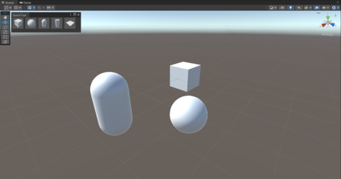
4. Inside the QuickTool class, create the actual callback CreateObject. It’s a simple method that instantiates a primitive according to the button’s parent’s name.
private void CreateObject(PointerUpEvent _, string primitiveTypeName)
{
    var pt = (PrimitiveType) Enum.Parse
                 (typeof(PrimitiveType), primitiveTypeName, true);
    var go = ObjectFactory.CreatePrimitive(pt);
    go.transform.position = Vector3.zero;
}
5. Save everything and go back to Unity. If you open your window, it should display the buttons, but they should all appear “crushed”: they are aligned vertically instead of in a horizontal row. You will fix this in the next section.
5. Style elements using a Unity style sheet (USS)
A VisualElement has style properties that affect the way an element is drawn on screen. These properties can either be set directly in C# (as we’ve seen earlier) or applied from a stylesheet. In addition to layout properties, there also exist several properties concerning graphics, such as backgroundImage or borderColor.
Style sheets are supported in Unity via the USS file format. USS files allow you to declare multiple selectors. Mainly:
- Starting with “.” will match on class (elements that are given a specific class will adopt said class’ properties);
- Starting with “#” will match on a VisualElement's name (which may not be unique);
- Simply typing a word will match on type (eg. Button) that corresponds to a C# type.
Note: For a certain ease of use, we will only use a single stylesheet for the entire window. However, you can use as many stylesheets as you want! To learn more about stylesheets in the UI Toolkit, click here.
1. Navigate to Assets > Editor > Resources inside the Unity Project View.
2. Use the main menu Assets > Create > UI Toolkit > Style Sheet to create a new USS file, and name it QuickTool_Style.
3. In your style sheet file, add the following style rule (using class selectors) corresponding to the buttons’ container:
.buttons-container {
    /* Populates the elements in this container horizontally. */
    flex-direction: row;
    /* Makes the content of the container wrap when resized. */
    flex-wrap: wrap;
}
Note: Here, you are only setting Flex properties. It’s at the core of any UI Toolkit layout and understanding their workflows is mandatory. To learn more about Flex properties, click here.
4. Create the style rules (using class selectors) for the buttons and icons:
.quicktool-button {
    width: 50px;
    height: 50px;
    /* Style rule that aligns items on the horizontal axis. */
    align-items: flex-start;
    /* Style rule that aligns items on the vertical axis. */
    justify-content: center;
}

.quicktool-button-icon {
    height: 40px;
    width: 40px;
    opacity: 0.8;
}

/* How the icon should behave when hovered. */
.quicktool-button-icon:hover {
    opacity: 1;
}

/* How the icon should behave when its parent button is clicked. */
.quicktool-button:active > .quicktool-button-icon {
    opacity: 0.6;
}
Note: Any styling done directly in a C# script overrides the same styling from a USS file. For example, if your USS file sets a margin-top: 5 and your C# sets a VisualElement.style.marginTop = 2, your element will have a VisualElement.style.marginTop = 2.
5. Next, you must associate a stylesheet to a VisualElement via the VisualElement.styleSheets.Add() method. To do so, in the QuickTool.cs script, extend the CreateGUI() method with the code below to load the stylesheet you just created and add it to the visual tree.
private void CreateGUI()
{
    // Reference to the root of the window.
    var root = rootVisualElement;

    // Associates a stylesheet to our root. Thanks to inheritance, all root’s
    // children will have access to it.
    root.styleSheets.Add(Resources.Load<StyleSheet>("QuickTool_Style"));

    // Loads and clones our VisualTree (eg. our UXML structure) inside the root.
    var quickToolVisualTree = Resources.Load<VisualTreeAsset>("QuickTool_Main");
    quickToolVisualTree.CloneTree(root);

    // Queries all the buttons (via type) in our root and passes them
    // in the SetupButton method.
    var toolButtons = root.Query(className: "quicktool-button");
    toolButtons.ForEach(SetupButton);
}
Note:
- Stylesheets modified while used in a running Editor window take effect immediately (meaning, no reload time) and should re-style your UI accordingly.
- Stylesheets can be attached to any VisualElement and their rules apply to all descendants of this container.
6. Save your file and go back to Unity.
Your custom Editor window is now done! You should have a small horizontal toolbar, and clicking on a button should instantiate what it’s representing directly in your Scene. Every object creation should be undoable/redoable.