
Create your own post-processing profile
Tutorial
Beginner
+10XP
25 mins
(146)
Unity Technologies
A post-processing profile can radically alter the visuals in your scene. In this tutorial, you will create your own post-processing profile to achieve a particular visual style in the project.
By the end of this tutorial, you'll be able to:
- Use common post-processing effects, such as bloom, depth of field, tonemapping, and color adjustments.
- Modify a post-processing profile to achieve a particular style.
- Appreciate the tradeoff between improved visuals and the cost to performance that comes with post-processing effects.
- Describe the purpose of a post-processing profile.
Resources
Languages available:
1. Overview
Now that you know what post-processing is and why it’s used, you’re ready to create your own post-processing profile.
A post-processing profile is a collection of post-processing effects configured to achieve a particular look and feel.
This can have a massive impact on your project.
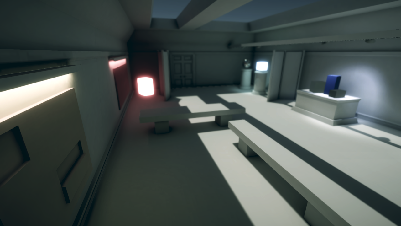
Look at the example below from Unity’s demo project, Neon. Post-processing completely alters the style of the scene.
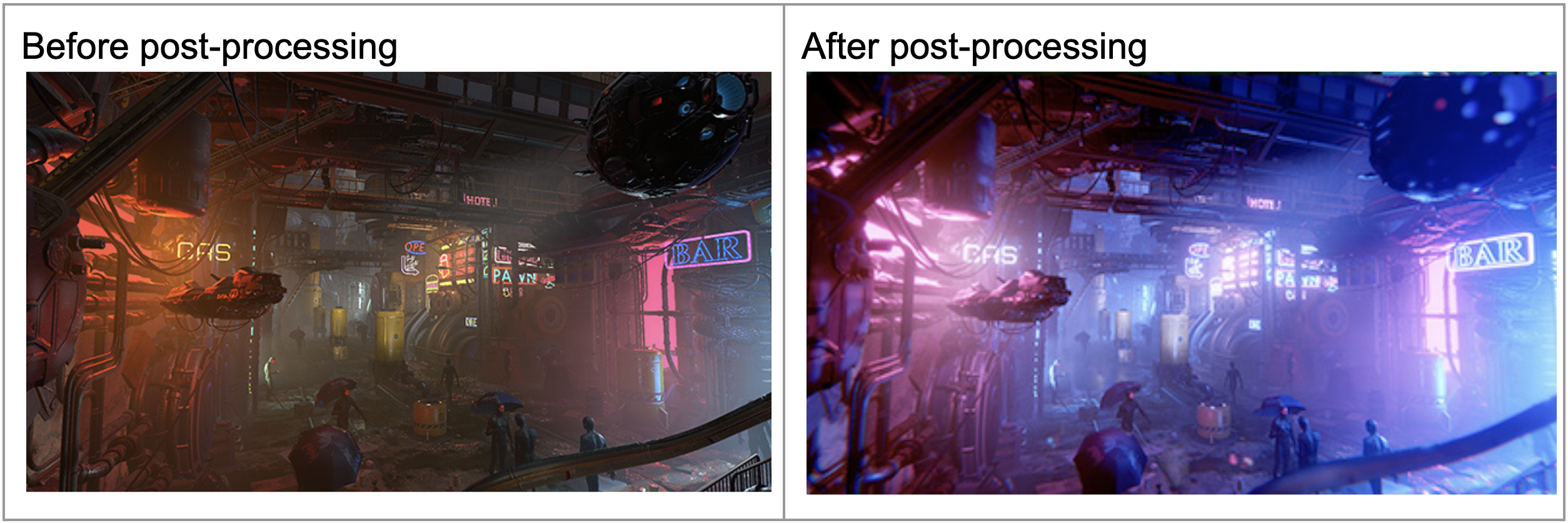
In this tutorial, you will select a target aesthetic for your scene and then attempt to achieve that aesthetic through post-processing.
Let’s start by choosing a stylistic direction.
2. Choose a visual style
Before you start adding any effects to your scene, you should determine the visual style you’re trying to achieve.
Below are a few examples of visual styles, along with famous movies that exemplify those styles.
Old western
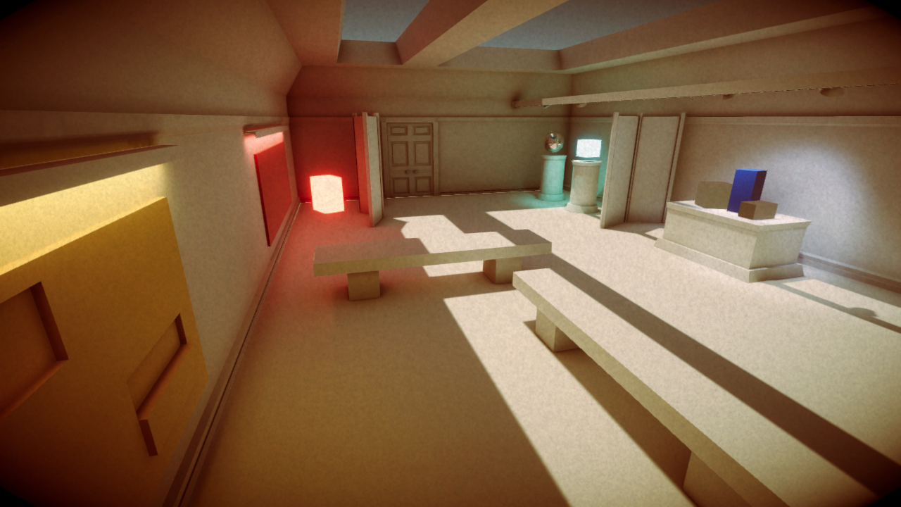
An old western style, similar to the movie, The Good, the Bad, and the Ugly (1966):
Bright and colorful
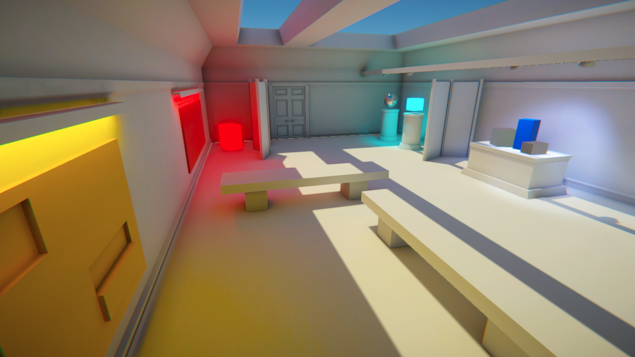
A bright and colorful style, similar to the movie Finding Nemo (2003):
Dystopian green
A dystopian green style, similar to the movie, The Matrix (1999):

Dark and gritty
A dark and gritty style, similar to the movie Man of Steel (2013):
Inspect the examples
Looking at the examples above, try to determine what it is about each image that is contributing to the overall aesthetic.
For example, in the first “old western” example:
- The entire scene has a brown tint.
- There is a grainy quality to the image.
- The shadows are very dark, making it hard to see details in shadowy areas.
Challenge yourself and try to complete this exercise for the other three examples.
Select an aesthetic for your project
Identify which aesthetic you would like to target for your project:
- Old western
- Bright and colorful
- Dystopian green
- Dark and gritty
If none of the above appeal to you and you want to try something else, try to find one or two inspirational images that will help guide your color palette.
With your goal in mind, let’s get started.
3. Create a new post-processing profile
As you learned earlier, a post-processing profile defines the combination and configuration of effects to be applied to a Volume (or area) of your scene.
Let’s make a new one for you to work with:
1. Select the Postprocessing Global Volume object in the Hierarchy, then in the Volume component, select the More (⋮) context menu in the upper-right corner and select New to create a new profile.

This will automatically create and assign a new blank profile, resetting your scene’s appearance to its default state.
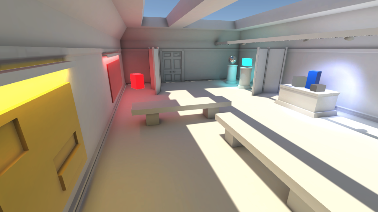
To stay organized, you should locate and rename your new profile.
2. In the Volume component, click on the profile’s name. This will automatically locate and highlight it in the Project window.
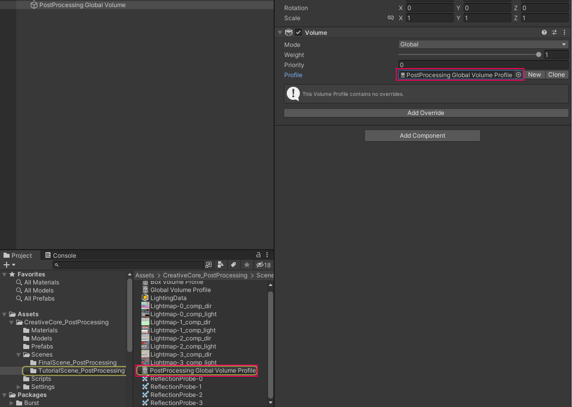
3. Rename it to something like, “PostProcessing - bright and colorful” (depending on your goal) and then relocate it to a folder that makes sense, like a Settings folder.
You now have a blank profile, and are ready to start adding effects.
4. Add Bloom
What is Bloom?
Bloom is one of the most popular post-processing effects, and may benefit your profile, regardless of the style you’re going for.
When real-world cameras take pictures of really bright lights, the camera is overwhelmed, resulting in a glowing effect around the light source.
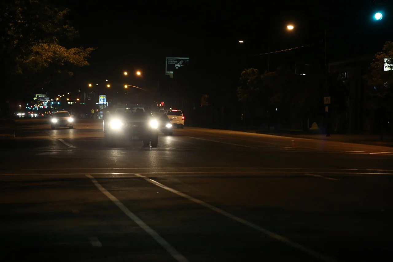
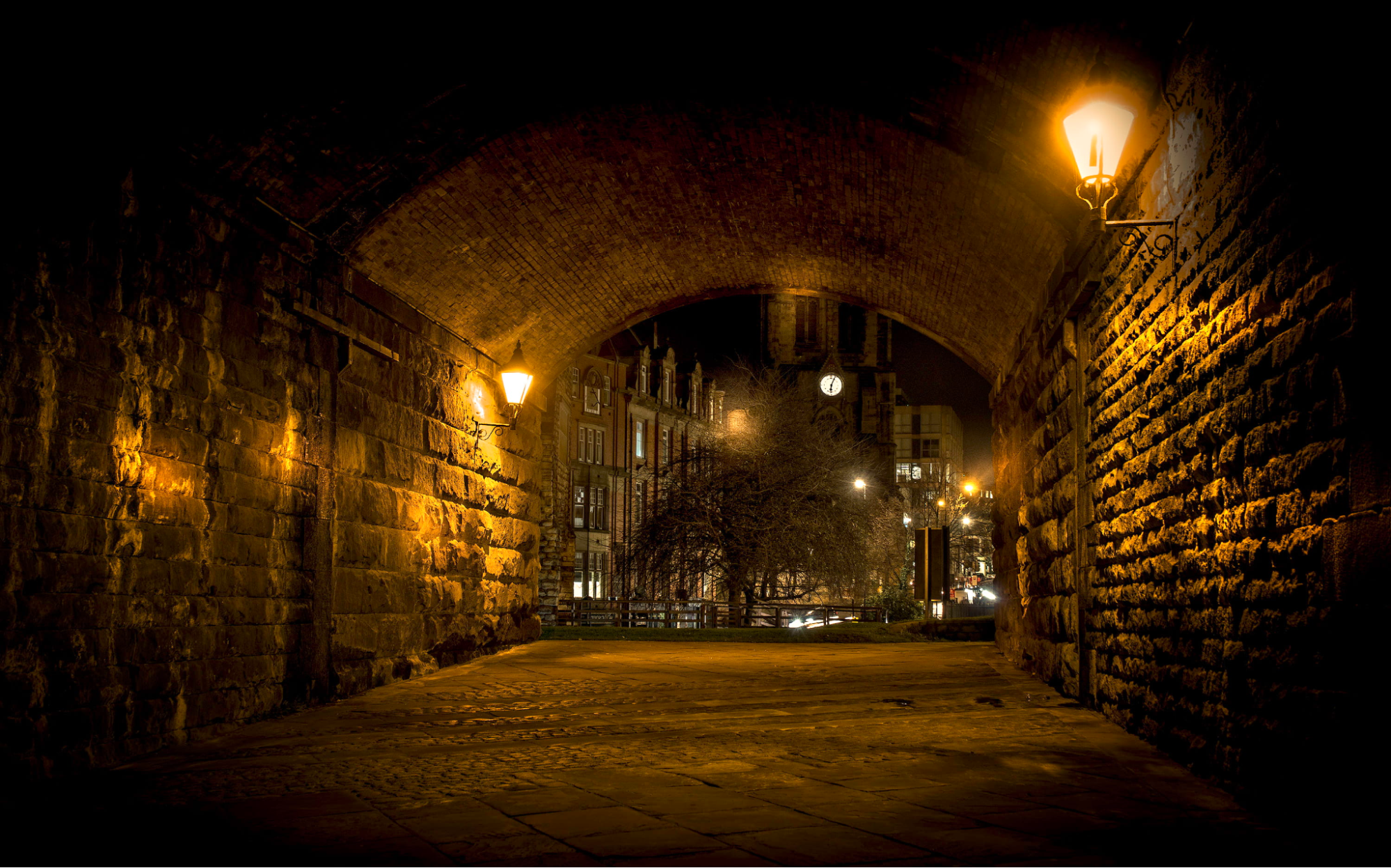
Unity’s Bloom effect simulates this camera behavior, conveying that a light source is extremely bright.
Add Bloom to your scene
The easiest way to appreciate how Bloom works in Unity is to try it out:
1. Select the Postprocessing Global Volume object in the Hierarchy
2. At the bottom of the Volume component, select Add Override, then select Post-processing > Bloom.
It’s called an “Override” because you are choosing to override (or change) the way the scene is currently rendered. This will add a new Bloom Volume override component with all of its properties disabled by default.
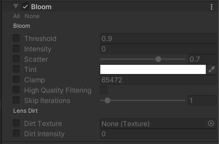
3. Enable the Threshold and Intensity properties, then increase the Intensity value to 1.0. You should now see the glow effect in your scene, especially around the red box, the light blue box, and the bright spot behind the darker blue box.

Try toggling the effect on and off with the checkbox next to the Bloom component to appreciate the effect.
4. If you want, enable and experiment with the other Bloom properties to see their effect. You can learn more about them in the Bloom documentation or in this tutorial.
Note: You are only able to implement Bloom if HDR (high dynamic range) is enabled in your camera’s rendering settings and if lights or emissive materials are bright enough. If you’re interested, you can read more in the HDR documentation and the emissive materials documentation. You’ll also learn more about HDR in the next step.
5. Apply Tonemapping
Tonemapping is an important feature for making your scene look its best on screen. But in order to understand what tone mapping is, you first need to understand what HDR is.
What is HDR?
If HDR (high dynamic range) is enabled, it allows for a wider range of brightness values (or luminosity) in your scene.
For example, with normal LDR (Low Dynamic Range), you might be able to show a light with a maximum brightness value of 1.0. But with HDR, you could show a brightness value of 1.5 (or higher if you want!).
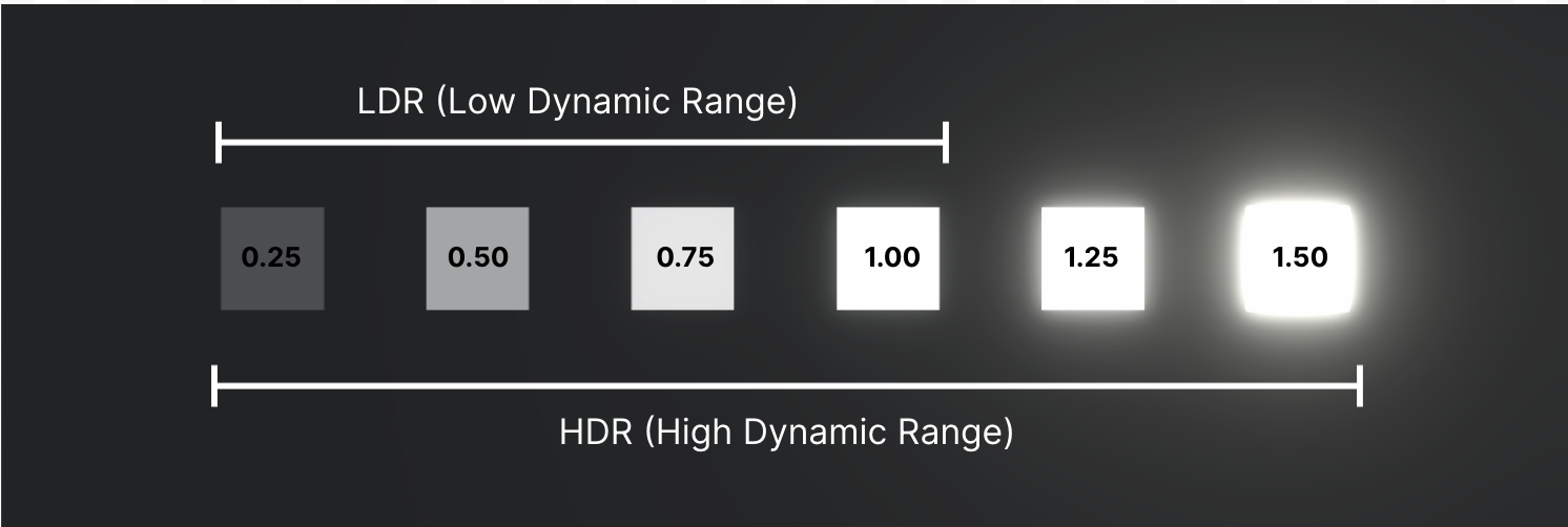
Without HDR, any value above the maximum LDR brightness would appear identical, which would be very disappointing:
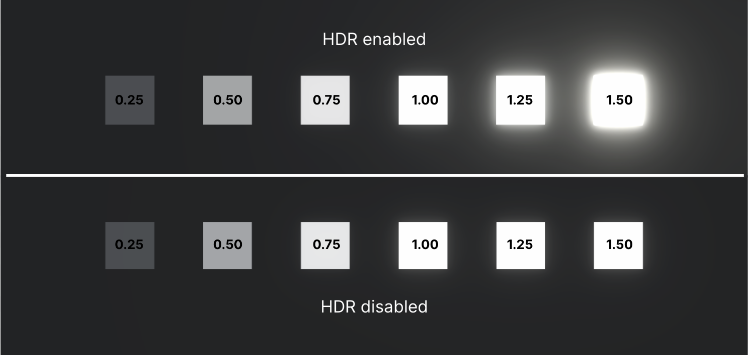
In fact, it’s HDR that allows for the Bloom effect, since it can process lights that are “too bright” for the normal range.

The problem displaying HDR
There’s a problem, though. Even though we can crank the brightness of an object in our scene to be as bright as the sun, normal screens are not capable of displaying that brightness.
Think about it: when was the last time you had to squint to look at a TV screen like you do when you look at the sun?
So, when your limited screen hardware tries to represent really bright objects, it reaches the limits of what it's physically capable of and just turns the whole area white, washing out any and all details in its path.
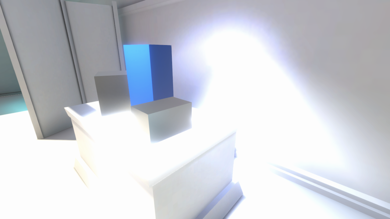
That doesn’t look great – and it’s not how it would appear in real life. That’s where tone mapping comes in!
What is tone mapping?
Tone mapping takes those really extreme brightness values and re-”maps” them to lower values, which recovers details in those washed out areas that would otherwise be lost in splotches of white.
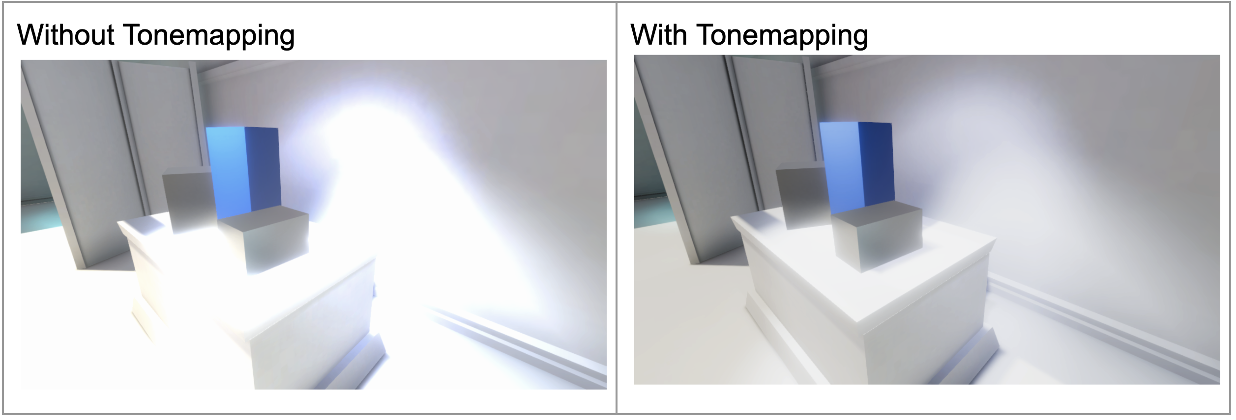
Look at how much more detail you can see on that wall with Tonemapping enabled.
If all that was a bit confusing, that’s OK. The most important thing for you to know is that if you’re using HDR, and especially if you’re using Bloom, you should apply Tonemapping to make sure those super bright spots still look good.
Add Tonemapping to your scene
Luckily, implementing Tonemapping is much easier than actually understanding it, so let’s do that now:
1. Select the Postprocessing Global Volume object in the Hierarchy.
2. At the bottom of the Volume component, select Add Override, then select Post-processing > Tonemapping. Note that you can also search for “Tonemapping” in the search bar after selecting Add Override.
3. In the new Tonemapping component, enable the tonemapping Mode property and from the dropdown select either Neutral or ACES, whichever you think looks better.

Neutral and ACES (Academy Color Encoding System) are just two different ways of performing the Tonemapping operation that produce slightly different results. As you can see by looking at the red and light blue boxes in the scene, ACES has a greater effect on colors in the scene.
For a simplified example, examine the images below.

With bloom and Tonemapping in place to make your lighting look as good as possible, it’s time to turn to the colors in your profile.
6. Do some color grading
What is color grading?
Color grading is the process of adjusting the color levels in your scene in order to achieve a stylistic effect, which can have a huge impact on the perceived genre of your project.
You have already looked at some classic examples from movies, but consider the wide range of color palettes used in games as well. All of the examples below were made with Unity.
Depending on the brightness and range of the colors in the environment, your project can convey horror, sci-fi, artsy, or kid-friendly vibes.
There are people in media production – sometimes called Colorists – whose entire job is to put color theory into practice through color grading.
We will only scratch the surface of what is a very complex art and science, but let’s give it a shot.
Add color grading to your scene
To do color grading, let’s add the Color Adjustments override module to your profile:
1. In the Volume component, add the Color Adjustments volume override component.
You can read more about what each of the properties does in the Color Adjustments documentation, but it’s easier to just play around with them and see what they do.
2. Use the Color Adjustment properties to try and get as close as you can to your desired profile.
Previously in this tutorial, you took time to identify the differences in colors between each of these styles. Now is the time to apply that in your scene.
Below is some guidance on each example style that might help.
Bright and colorful
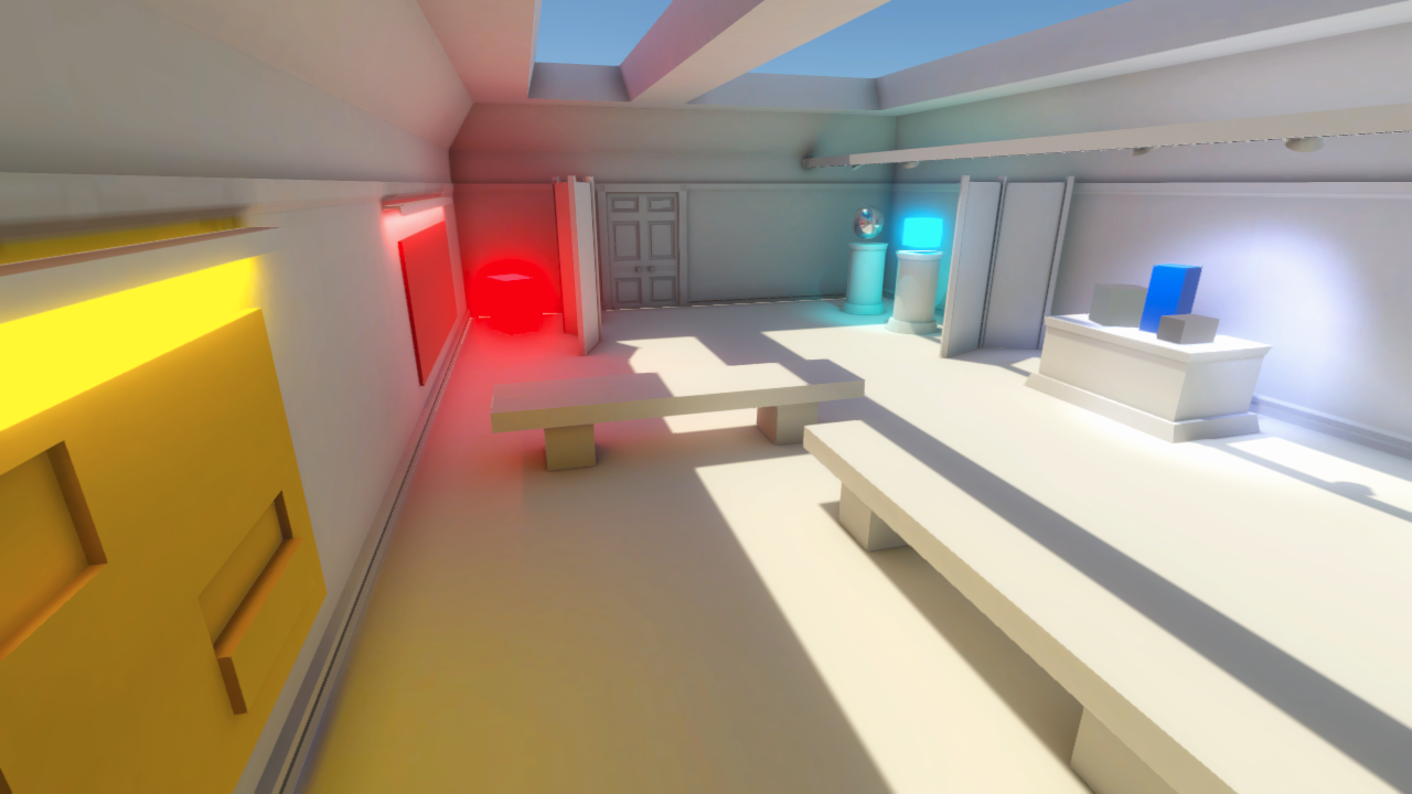
- Increase contrast and saturation
- Neutral tonemapping
Old western
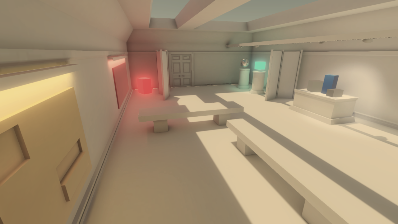
- Increase exposure
- Decrease contrast and saturation
- Add a yellow color filter
- Neutral tonemapping
Dystopian green
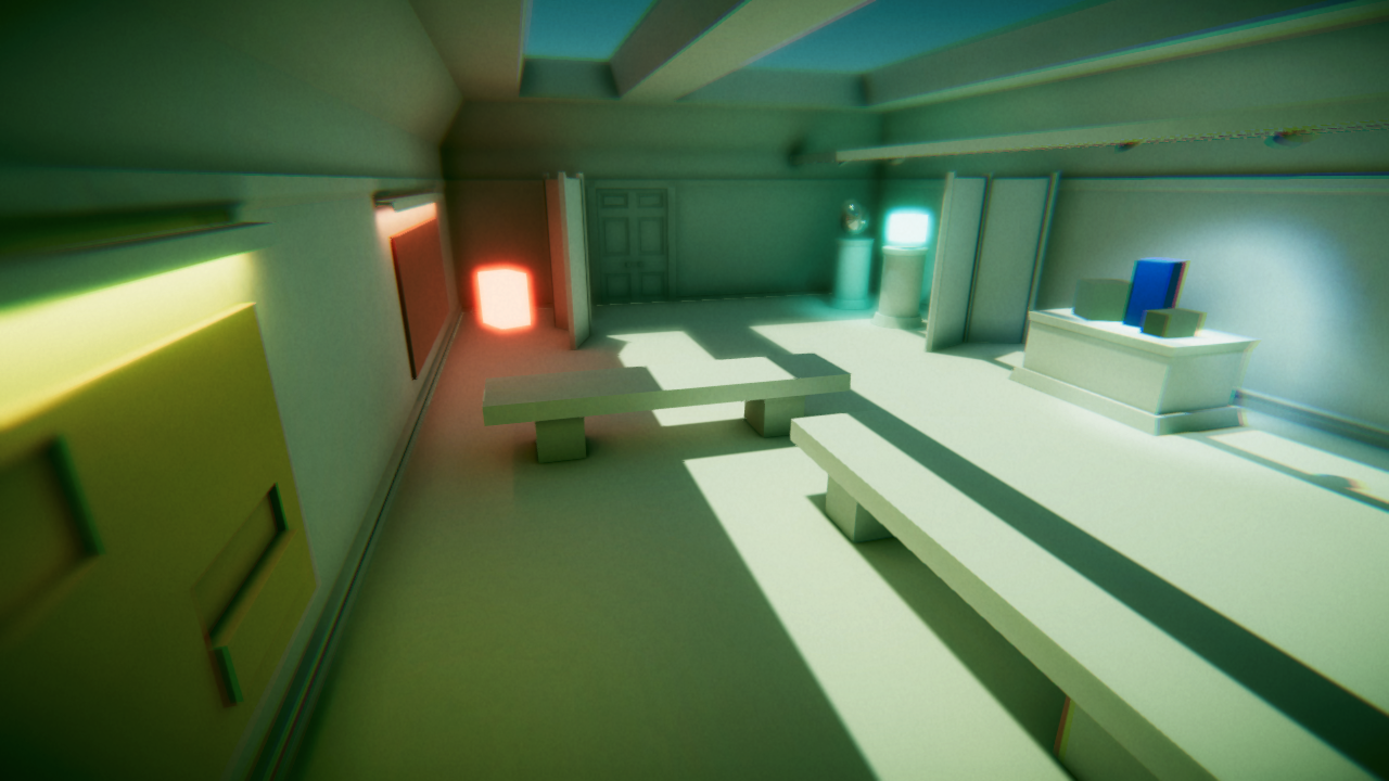
- Decrease saturation
- Add a green color filter
- ACES tonemapping
- Increase Bloom
Dark and gritty
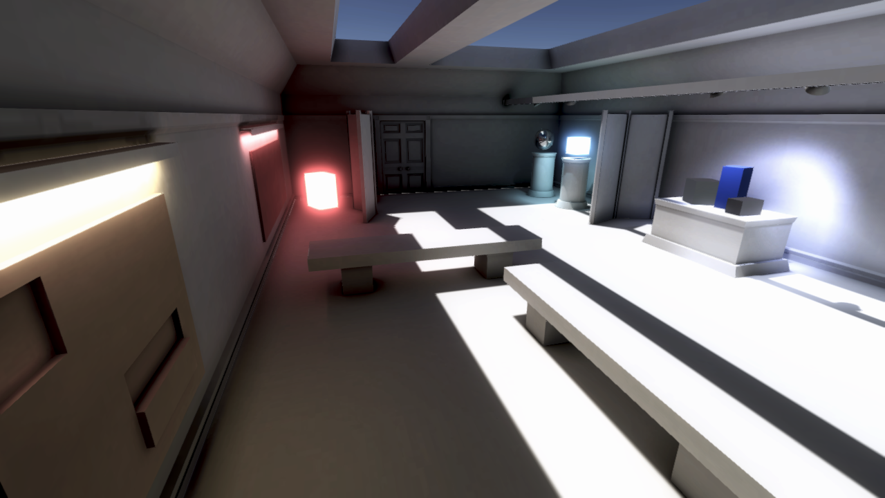
- Decrease exposure and saturation
- Increase contrast
- Add a blue color filter
- ACES tonemapping
The Color Adjustments override component can get you a long way, but you can get even more precise control over the colors in your scene.
3. In the Volume component, add the Lift, Gamma, Gain override, then use the checkboxes under the color trackballs to enable each one.
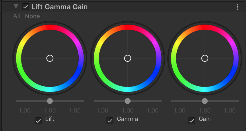
This is what’s known as a three-way color corrector, since it allows you to independently adjust three types of colors in your scene:
- The dark tones in your scene (Lift)
- The mid-tones (Gamma)
- The bright highlights (Gain)
4. Play around with each of the trackballs and the sliders beneath them to fine-tune the color grading in your scene.

In the example above, the dark tones (Lift) were brought down to make the shadows darker and more dramatic, while the midtones were brought up so the image wasn’t too dark. Note that you can perform nearly the same adjustments using the Shadows Midtones and Highlights override.
Most of the time, the basic Color Adjustments override will be sufficient, but if you have a very particular look in mind, three-way color correction can be helpful.
If you want to experiment with other color-related post-processing effects, experiment with the white balance, split toning, and color curves overrides.
With color grading done, you can now turn your attention to some of the other fun post-processing effects!
7. Try out some other post-processing effects
With some of the most commonly used effects already implemented, let’s experiment with some of the other effects.
Once again, rather than explaining every property of every effect here, just play around with them and see what they do! You can always read up on the specifics in the documentation.
But remember: post-processing does not come for free. Every effect you add slows down your scene. Only use an effect if it really enhances the visuals.
Below are a few effects you might find especially useful.
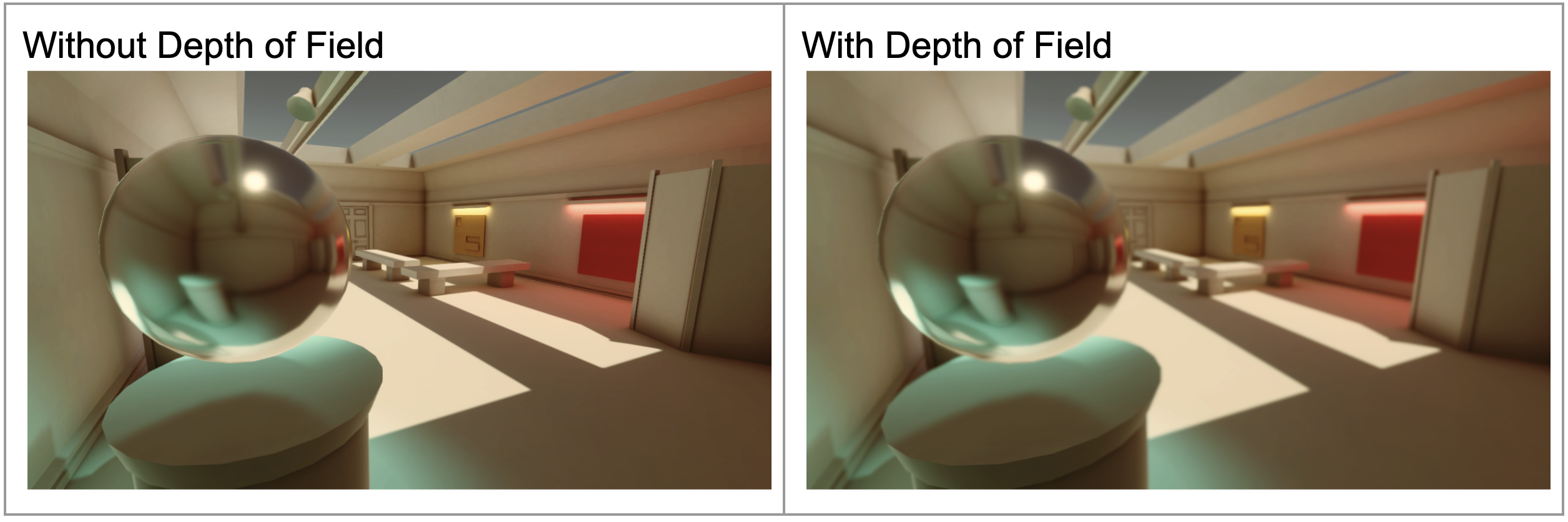
Depth of Field
Depth of Field keeps objects at a particular distance in sharp focus and blurs objects nearer or farther away. This gives your project more of a cinematic look. This effect has a significant impact on performance, so should be used sparingly.
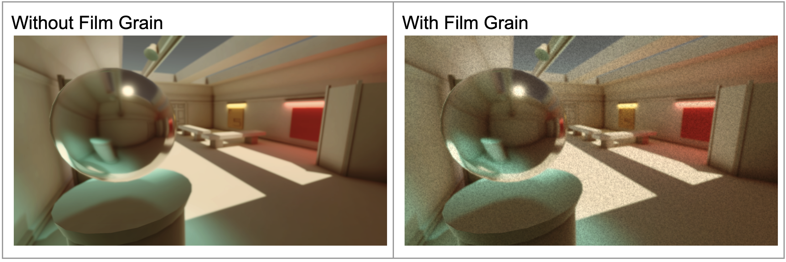
Film Grain
Film Grain simulates the grainy appearance you might see in old movies. This effect could be used to make an image seem like it is very old or maybe that it came from an archive.
Vignette
A vignette effect darkens the outside edges of the screen to emulate an effect that can happen with physical camera lenses. This might also be used to make something look old, or to focus the viewer's eye on the center of the screen.

Those are just a few of the effects to try out, but you might also want to check out the Lens Distortion, Motion Blur, and Chromatic Aberration overrides. Keep in mind that these effects can also significantly affect performance.
8. Explore: Create profiles for other visual styles
You have created one profile in the style of your choosing. Now try to use your skills to create other profiles for other styles. Just duplicate the profile you created, rename it to a different visual style, and see if you can achieve that aesthetic.
You could attempt one of the other examples from this tutorial (e.g. old western, dark and gritty, etc.), but you could also try something completely different.
9. Next steps
Congratulations! You have created your own post-processing profile to achieve a particular aesthetic throughout a scene. In the next tutorial, you will attempt a challenge to create a “local” post-processing profile, which will allow you to include multiple styles within a single scene.