
Challenge — Interactive UI Menus
Tutorial
Beginner
+10XP
30 mins
(9)
Unity Technologies
In this tutorial, you will build an interactive UI panel to disable different model parts, rotate the object, and adjust its transparency.
Resources
Languages available:
1. Overview
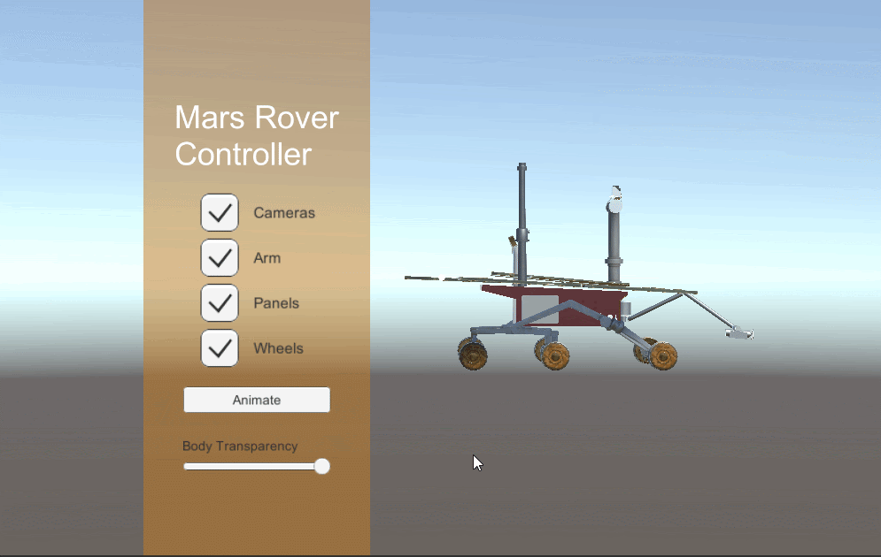
In this challenge, you will build an interactive UI panel to disable different model parts, rotate the object, and adjust its transparency. To do this, you will:
- Create a World Space UI Canvas with an image for a background, text as a header, four toggles, a button, and a slider
- Connect the four toggles to their respective Rover parts so you can turn the parts on and off
- Connect a button to the animation so you can play and pause it
- Connect the slider to the Rover body to adjust its transparency
2. Create the UI’s Background with a Canvas
Create a UI Canvas and convert it to World Space so you can properly place it in your 3D Scene.
- Create a new Canvas (GameObject > UI > Canvas).
- With Canvas selected in the Hierarchy, convert its Render Mode to World Space under the Canvas component.
- In the Canvas' Rect Transform component, change its position in the X, Y, and Z axes (Pos X, Pos Y, and Pos Z) to -1.7, .75, and 0, respectively. Change its width to 1.7 and height to 5.
3. Add a Background to the UI
Add an Image component to the Canvas and change the color to create a panel overlay.
- With the Canvas selected, right-click in the Hierarchy and select UI > Panel.
- Change the Source Image to None
- Adjust the Color to your liking.
4. Add Text to your UI
Add a Text GameObject to your Canvas to give the direction “Mars Rover Controller.”
- With the Canvas selected in the Hierarchy, create a Text GameObject (UI > Text).
- Configure the Text component: Add Mars Rover [Enter] Controller in the Text input. Set the font size to 60, alignment to Left, the horizontal and vertical overflow to Overflow, and its color to White.
- Configure the text's Transform component to match the screen grab below to reduce the text’s scale so it fits the Canvas.
5. Add Four Toggles
Create a Toggle Canvas, add the Grid Layout components so we can organize our toggles, and add the toggles so we can turn off the cubes.
- In the Hierarchy, with Canvas selected, add a new Canvas and rename it ToggleCanvas (UI > Canvas).
- Add a Vertical Layout Group to ToggleCanvas via the Inspector (Add Component > Vertical Layout Group).
- In Vertical Layout Group, adjust the parameters so three toggles can fit on the Canvas. Adjust the spacing to -170 and child alignment to Upper Left. Check both Width and Height under Child Force Expand.
- Add a Content Size Fitter to ToggleCanvas via the Inspector (Add Component > Content Size Fitter). Set the Content Size Fitter's horizontal and vertical fit to Preferred Size.
- Add four Toggle GameObjects as children of ToggleCanvas to turn the Rover’s parts on and off (Assets > Prefabs > Toggle). Set its width to 120, height to 20, and scale on each axis to 2.
- Rename each toggle to ToggleWheels, TogglePanels, ToggleArm, and ToggleCameras. Change each Text component to its respective name (Wheels, Panels, Arm, and Camera).
6. Link Up the Toggles
Link each GameObject to its toggle so that it turns off when unchecked and back on when checked.
- In ToggleWheels’ Inspector, drag RoverWheels into the OnValue Changed (Boolean) field (this is found in the Toggle component).
- Under the Event Trigger component, select the drop-down No Function > GameObject > SetActive. This will toggle the object on and off by enabling and disabling it.
- Repeat Steps 1-3 for TogglePanels, Toggle Arm, and ToggleCameras, dragging in the respective Cube GameObject.
7. Add a Button to Animate the Rover
Add a Button to the Canvas and configure it so we can play the Rover rotation animation.
- With the Canvas selected, add a Button GameObject (UI > Button).
- In Rect Transform, set the Button's Pos Y to -1 and the scale on each axis to .007.
- Expand the Button in the Hierarchy to reveal its child Text GameObject. Set its text input to Rotate Rover .
- To make the text clearer, reduce its scale in all axes in the Rect Transform to .15. In the Text component, set the font size to 100 and the horizontal/vertical overflow to Overflow.
- With the Button selected, find the On Click() parameter in the Button (Script) component, click the +, and drag the MarsRover GameObject into the None (Object) field.
- Select the drop-down titled No Function and pick Animator > Play (string). Type Rotate into the text parameter.
8. Create a Slider as a Child of the Canvas
Create a Slider as a child of the Canvas.
- With Canvas selected in the Hierarchy, create a Slider (UI > Slider).
- In the Slider's Rect Transform component, set its Pos Y to -1.5 and scale on each axis to .007.
- In the Slider component, set the Value to 1.
9. Create a TransparencyController GameObject
Create an empty GameObject and add the Transparency script component so we can adjust the Rover’s body transparency.
- In the Hierarchy, create an empty GameObject and rename it TransparencyController.
- Drag the Transparency.cs script from the Project window (Assets > Scripts) to the TransparencyController’s Inspector.
- Drag the RoverBody GameObject into the Rover field. Drag the OpacitySlider into the Opacity Slider Ref field.
- Change the Alpha Color to White.
- Drag the RoverBody_Transparent Material from the Project window (Assets > Material) into the Current Material Transparent field.
10. Key Takeaways
You've now made a fully interactive UI. You used Unity’s built-in design tools to build a simple, clean UI to adjust and interact with the Mars Rover.
By completing this tutorial, you’re now able to:
- Modify animation and transparency by setting them as UI references
- Automatically align UI components using Unity’s auto layouts features: Horizontal Layout, Vertical Layout, Grid Layout
- Interact with these objects using the HoloLens
Continue on to put these new learnings to the test and challenge yourself to build a UI panel for a training application.