
Challenge — Interactive UI Menus
Tutorial
Beginner
+10XP
30m
(6)
Unity Technologies
In this challenge, you will be building out a fully-functional, Vive-interactable UI panel to control the environment type, Scene lighting, object rotation, and object Material.
Resources
Languages available:
1. Overview
The previous tutorial was an introduction to interactable User Interfaces (UIs) using different interaction components. Now we will practice what we learned in this challenge. By the end of the challenge, you will be able to use these scripts in your own projects and build out a fully-functional UI panel.
In this challenge, you will build out a fully-functional, Vive-interactable UI panel to control the environment type, Scene lighting, object rotation, and object Material. To do so, you will:
- Build and design the interactive UI panel.
- Convert the UI panels so they receive Vive input.
- Add and configure the Environment Swap script to change the surrounding environment.
- Add and configure the Lighting script to control the lighting in the room.
- Add and configure the Material Swap script to control the Materials on the car model.
- Add and configure the View script to modify the car model’s rotation.
This challenge has two parts: designing the Home Page (Part 1) and integrating the “Tool” scripts (Part 2).
In Part I, you will build your own UI panel and add functionality to switch to the other panels.
In Part II, you will link up various scripts to the UI so the buttons access important functionalities (environment swap, lighting manipulation, Material change, car rotation).
2. Part 1: Setting up the Home Screen
Part 1 of this two-part UI challenge will lead you through setting up multiple UI screens. We will finish with the ability to click through the different UI panels with button clicks, and then return to the Home panel.
3. Replace the Main Camera with a VR-Ready Camera
Replace the default camera with the CameraRig Prefab so we can use our controllers.
- Add a VR CameraRig Prefab to the Hierarchy.
- Delete the Main Camera.
4. Add the Vive UI Laser Pointer Script to Each Controller
Add the Vive UI Laser Pointer component to your dominant hand’s controller so you can interact with the buttons.
- In the Hierarchy, click on the right or left controller.
- In the Inspector, add the Vive UI Laser Pointer component.
- Feel free to choose any color you would like.
5. Add and Place Images
Add four Image GameObjects as children of your Home UI panel. These will hold the navigational icons, and eventually be our buttons so we can click to other screens.
- In the hierarchy, click on UI > Home Screen.
- Add an Image and adjust its Rect Transform width and height so we can add four images in a grid. We chose a width and height of .2.
- Add a Text GameObject as a child of the Image.
- Resize, reposition, and recolor (to white) the text so it sits on top of the image. Remember: scale up, center, and change the overflow of the text. See the UI Basic tutorial if you need a review.
- Duplicate the image three times (Command + D or Control + D) and adjust the images evenly on the page. We are adjusting their positions to get an approximate idea of where they should lay before using the Grid Layout component to automatically space and align the images.
- Change the text copy to View, Materials, and Environment, and rename the images to their respective text copy.
6. Add a Canvas GameObject as a Child of Home Screen. Rename it Buttons.
Add a Canvas GameObject as the Home Screen’s child so we can house our button GameObjects separately from the rest of the Home Screen features (header and home).
- In the Hierarchy, select the Home Screen canvas.
- Create a new Canvas by right-clicking on the Home Screen GameObject
- Ensure that it sits over the Home Screen Canvas, adopting its parameters (size, rotation, and position).
7. Align the Images into a grid
Align the images perfectly by adding a Grid Layout component to the Buttons Canvas and dragging the four images under the Canvas as children. We will adjust their new sizes in the subsequent steps.
- In the Inspector, set the Constraint Parameter to Fixed Column Count, with a Constraint Count value of 2.
- Adjust their Cell Size to appropriate sizes. We chose .2 for both X and Y.
- Adjust the spacing so there is an appropriate gap between all of the images. We chose .1 and .11 for X and Y, respectively.
- Change the Child Alignment to Middle Center, so the GameObjects (images) align with the center of the panel
8. Convert the Images to Buttons
Convert the images to buttons by adding a Button component.
In the Hierarchy, select all four images and add the Button Component in the Inspector.
9. Add Icons to the Buttons
Increase the buttons’ transparency by reducing the color’s Alpha, add icons to each button, and adjust them accordingly so we can clearly recognize their functionality.
1. Decrease the button images’ Alphas so they are completely transparent.
2. In the Hierarchy, add new images under each Image GameObject and adjust their width and height to match their parents’ width and height (.2).
3. These images will house our icons, and were created as separate images (as children of the buttons) so we can independently scale and position them once we add our icons.
4. In the Project window, find the Home Button and add it to the images, respectively (Assets > UI Images > Home Page).
5. Adjust the icons so they better fit their buttons. Because we added the second set of images as children, we can adjust these icons independently from the buttons (which are constrained to the Grid Layout).
Tip — Lowering the Alpha of a Button's Image
A button must have an Image component to register as a clickable button. That Image component is locked to the size of the button. When using the Grid Layout, all buttons and images have the same dimensions, making customizing the size and shape of icons impossible.
To modify the button’s icon without changing the size of the Grid Layout, make the button transparent by reducing the Alpha and add a new image as a child. This child Image will house the icon, and can be tweaked manually (while the Grid Layout continues to control the size and shape of the parent button).
10. Set up the UI Manager’s References
Set the UI Manager to reference each UI panel so it knows which panels to turn on and off.
- In the Hierarchy, select the UIManager.
- Drag in the appropriate references so we link up the buttons to their respective panels.
What is the UI Manager?
The UIManager is an empty GameObject that holds one UI Manager script. Scripts that control the state of an object, are known as managers.
The UI Manager has two responsibilities:
- Toggling on/off the different UI panels.
- Adjusting the position and rotation of each panel to match that of the Home panel (at run time).
The UI Manager toggles on and off different panels by calling specific methods. For example, the UI Manager will toggle off the Home panel and toggle on another panel, depending on the method called (e.g., the Lighting panel when the SwitchToLighting method is called).
By toggling off the Home panel and toggling on the (called) panel, we simulate the UI flipping screens to another UI state.
11. Link Up the UI Buttons to the UI Manager and Their Respective Panels
Link up the buttons to their respective panels by referencing the UI Manager so we can click to different panel screens.
- Find the UI Manager in the Hierarchy (Hierarchy > Managers > UI Manager).
- Select all of the buttons and add a new OnClick event.
- Drag the UI Manager in as a reference for all of the buttons.
- Select each button’s respective method in the UI Manager:
Lighting = SwitchToLights
View = SwitchToView
Materials = SwitchToMaterials
Environment = SwitchToEnvironment
12. Convert the Bottom Home Icon to a Button
Convert the bottom Home image into a button by adding a Button component so we can use it to toggle back to the Home panel.
- Select the images holding the house icon and add a Button component.
- Link up the UI Manager to the button’s OnClick event.
- Select the SwitchToHome method.
Explore — Click Play and Try Out the UI
Go ahead and click Play. You can now point to and click the buttons to navigate to the next UI panel. Click the Home button to return to the Home Screen.
13. Part 2: Setting Up the Home Screen
Now that we’ve designed and linked our Home Screen, let’s add functionality to the other four screens.
To save you some time, we’ve already designed and built out the other four screens for you. Now you need to set up the proper references to add functionality to each panel.
Feel free to build out the other panels yourself as an extra challenge. You can either match the panels we provided, or add your own creative touch by aligning the buttons differently.
14. Add the UI - Full Prefab to the Scene
Add the UI - Full Prefab to the Scene and delete the old UI so we can use the new UI panels.
In the Assets window, find the Prefab folder and drag in the UI - Full object.
Explore — Build the UI Yourself
Feel free to build these panels out yourself! All of the icons are in the UI Images folder.
15. Re-establish the UI Manager’s Panel References
Set the UI Manager to reference each UI panel so it knows which panels to turn on and off. In an earlier step, we set the UI Manager to reference the old UI. We must now repeat this step with the newly added UI Prefab.
- In the Hierarchy, select the UIManager GameObject.
- Drag appropriate references into the UI Manager to link up the buttons to their respective panels.
16. Environment Swap: Set up the Environment Manager
Set the Environment Manager’s references so we can connect it to each Environment button.
- In the Hierarchy, select the Environment Manager.
- In the Inspector, change the Size to 3, since we have three environments to choose from.
- Drag the Room GameObject into the Room Object parameter. The first Element will be our model environment (currently active in the Scene). By dragging in the Room GameObject, the Manager knows to turn the room on or off when prompted.
- The manager turns all of the GameObjects on/off at once, in each Element. Note: Since the Environment GameObjects is a list, you can add as many GameObjects to turn on and off at once (with the room GameObject). In this Scene, we only have one we need to turn off (the room).
- Leave the Skybox Material as None, as we don’t need to have a Skybox applied to the environment when the room is active. See the Lighting - Intermediate tutorial for a refresher on Skyboxes.
- In Element 1, add Day - PeaceGardens as your first Skybox Material (Assets > Materials > Skybox Materials).
- Leave the Environment GameObjects list empty, since there are no 3D GameObjects in the Scene when you turn on the Skybox.
- In Element 2, add Dusk - PeaceGardens. Leave the Environment GameObjects list empty as well.
What is the Environment Manager?
The Environment Manager is a script responsible for changing the environment. We will reference this GameObject so we can access the script when we link up our Environment UI panel in the next step.
17. Set the Environment Manager Reference
Reference the Environment Manager from each Environment button so we can swap our environment and test our car model’s look and feel in photorealistic environments
- In the hierarchy, select the Indoors button and drag in the Environment Manager GameObject as an OnClick reference.
- Select the EnvironmentSwitch method.
- Leave the index at 0. Remember: The index number references specific spots on the Environment Manager list. Index 0 references Element 0 in the Environment Manager.
- Repeat this step for Outside - Day Button and Outside - Night Button, but change their index references to 1 and 2, respectively.
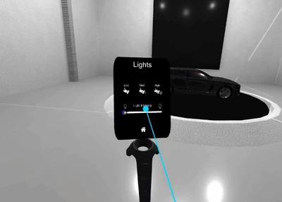
18. Set up the Lighting Manager
Set the the Light Manager’s references so we can manipulate the lights in the Scene.
- Change the Lights list’s size to 5, since there are five Point Lights that we will manipulate in the Scene.
- Drag each of the five Point Lights into the list.
- Modify the Low Light, Med Light, and High Light values to appropriate ranges. We found .1, .75, and 1.25 to be appropriate values, respectively.
- Warning: If the High Light is too high, it can irritate the user’s eyes. Use caution when adjusting this max parameter. We recommend a max of 1.5.
19. Controlling Light Intensity
Link the Lights UI panel toggles to the Lighting Manager so we can use the UI to control each light’s intensity.
- Select the Low Light, Med Light, and High Light Toggle GameObjects and drag in the Light Manager as the reference.
- Select their respective methods (ex: High Light Toggle > HighLights).
- Select the Slider, and add five new OnValueChanged events.
- Drag in the Point Lights as the references.
- Select Light.Intensity to control the lights’ intensity values. Light.Intensity is a native feature in Unity, so we don’t need add a script to access this.
- Adjust the slider’s Max Value to 2, so we don’t harm the user’s eyes.
20. Set up the Material Manager
Set the Material Manager’s references so we can change the Materials on the car with the UI panel.
- In the Hierarchy, select the Material Manager.
- Add our nine car Materials to Materials list (Assets > Materials > Car Materials).
- Add the Frame - Top and Frame - Sides to the M Rends list. These are the two parts of the car model that make up the car’s body.
What is the Material Manager?
There are three things the Material Manager is responsible for:
- Materials List: Holds all of the Material options for the car model
- Mesh Renderers: Holds all of the Meshes to which we will add our Materials
- Enabled Color Index: Describes which Material is active on the car model
21. Linking Up the Material Toggles
Link up the Material Toggles to the Material Manager so we can swap out the Materials on the car by selecting the buttons.
- In the Hierarchy, select all of the Material Toggles and drag in the Material Manager as the reference.
- Select the SwitchMaterial method and add the corresponding index number (e.g., Material 0 > Index 0).
22. Set up the Car Rotate Manager
Link up the Car Rotate Manager so we can rotate the car for six important views: Front, Left Side, Right Side, Rear, Front 3/4, Rear 3/4.
- In the Hierarchy, select the CarRotateManager GameObject.
- Add the Car Placeholder into the CarRotatePresets.CarModel parameter.
- Add the Player GameObject into the CarRotatePresets.Player parameter.
- Add the Car Placeholder into the Rotation.ModelObject parameter
- Adjust the Rotate Value to an appropriate speed. We found 1 to make sense, but you can use any value you would like.
23. Assigning the Rotation Manager
Assign the Rotation Manager as the reference for each position button so we can change the model’s position on each button click.
- Drag the CarRotateManager into each button’s OnValueChanged event.
- Assign the relative method to each button (ex: Front Toggle > Front()).
24. Adding the Button Extender Script
Let’s set up the Left, Center, and Right buttons at the bottom of the panel by adding the Button Extender script and making a new On Click Hold event.
- Select Left, Center, and Right, and add Button Extender as a new component
- Create a new OnHold event.
- Drag in the CarRotateManager as a reference.
- Select the appropriate method based on the button:
Left → RotateModelLeft
Center → RecenterObject
Right → RotateRight
Explore — Try Out Your Fully Functional UI
Congratulations! You've officially made a functional UI to hold your tools for your Automotive Design Review VR application.
Be sure to click play and give it a try! You’ll notice that all of the panels move to the Home panel’s position and deactivate. When you click the Play button, a script tells the panels to match positions and then to activate or deactivate depending on the UI’s state.
25. Key Takeaways
You have now built a fully functional UI by adding new buttons and toggles, descriptive icons, and linking these interactive UI features to their respective managers to control the environment, lighting, and object positioning.
By completing this module, you’re now able to:
- Build and configure Environment, Position, Material, and Light Managers
- Build out a Vive-interactable UI with toggles and buttons
- Make this UI interactable with Vive controller input
- Configure the UI to control the environment, light intensity, object rotation, and object Materials.