
Manipulating Scene Assets with an Interactive User Interface (UI)
Tutorial
Beginner
+10XP
30 mins
(9)
Unity Technologies
In this tutorial, you will learn how to build several UI menus with buttons and sliders, and interact with these menus with controller input.
Resources
Languages available:
1. Why UI?
User interfaces (UI) are digital panels of information and controls used to interact with the computer. These are critical in virtual reality — they communicate messages from the machine to the user, and the user to the machine. They provide users with information, such as system status, contexts, and uses, as well as allow interaction with the virtual world, via buttons, sliders, and levers.
UIs enable people to operate equipment and tools in the virtual environment, and even change environmental settings, such as lighting and colors.
In this tutorial, you will learn how to build several UI menus with buttons and sliders, and interact with these menus with controller input. In the Label Objects with Text and Images tutorial, we covered how to make and use UI as a non-interactive information tool. In this tutorial, you'll learn how to make an interactable UI with buttons, sliders, and toggles.
In the challenge afterwards, you'll control the lighting in your Scene using several buttons and other interactable components.
--------------------
Interactive UI Menus
Well-designed UIs are intuitive, accessible, and habitual. We rely on clean, organized, and intuitive UIs to communicate in-app functionality as we navigate through the experience of discovering new features.
We see user interfaces everywhere, from our smartphones and computers to the ticket dispenser for the train. These are the intuitive communication tools that translate our intention to a computer language, which then acts upon command. If not for UI, we would have to write code to communicate and interact with computers, which is a much more challenging and tedious form of communication.
This tutorial is an introduction to interactable UIs. It will help us understand the use cases for interactable user interfaces and the primary UI interaction components (buttons, sliders, toggles, and scroll bars). To do so, you will create an interactable user interface to control various lights in a simple Scene and configure the new UI to be compatible with Oculus Go input controls. After the tutorial, you will be able to build out an interactable UI for any application.
By building out this tutorial, you will learn how to rapidly prototype an interactive UI and, in turn, enabling you to build out an interactable UI for any application.
What Will You Do?
- Add buttons, toggles, and sliders to your Scene’s UI.
- Turn the Scene lights on and off with button input.
- Increase and decrease the intensity of the lights with the slider.
- Convert the UI to WorldSpace (placing it in your 3D environment), and make it VR-interactable with VR controller input.
To do so, you’ll need to:
- Create a UI Canvas and add interaction components: Buttons, a Slider, and a Toggle Group.
- Consolidate these components onto one UI panel and organize them with the Canvas Layout component.
- Make the interaction components functional / interactable on your desktop using mouse inputs and test the UI with your mouse.
- Convert the UI to receive Oculus Go controller input.
2. Create a UI Canvas and Add Interaction Components: Buttons, a Slider, and a Toggle Group
Create a menu with a UI Canvas to hold all of our interactable UI components, such as buttons and sliders, by adding a panel to the Scene.
- In the Hierarchy, create a UI Canvas that will hold all of your interactable components (Create > UI > Canvas).
- To make the UI’s background, add a Panel as a child of the Canvas (Create > UI > Panel).
- Recolor the panel to a color of your preference. We chose a light, slightly transparent blue (HEX color #00565A64).
Tip — UI Components need a Canvas to render
All UI elements need a Canvas as a parent. It's in our best interest to make a Canvas first, and then add all of the required UI elements as children.
3. Add Buttons to Your Panel
Add light-control functionality to your panel by adding a new Canvas and two buttons to turn the sun on and off.
- In the Hierarchy, create a UI Canvas to hold the two buttons (Create > UI > Canvas).
- Place the Canvas in the center of the original Canvas and rename it Button Canvas - Horizontal.
- In the Hierarchy, add a button to the new Canvas (Create > UI > Button).
- Position the button in the center of the Canvas and rename it Sun Off.
- Duplicate the button and name the new button Sun On. Adjust the two buttons’ positions so they sit at the bottom of the canvas panel.
--------------------
What is a Button?
The most common interactable UI element is a Button. The button has a single event called On Click that responds when the user “clicks” the button in VR. An Event is Unity’s method for tracking specific occurrences. When Unity’s UI system recognizes a click event, or “OnClick,” it responds according to our specified logic.
Tip — Adjust the color properties of a button to indicate its different states (normal, pressed, disabled).
4. Align Buttons with Horizontal Layout
Align the new buttons with the Horizontal Layout Tool.
- Add the Horizontal Layout Group to Button Canvas - Horizontal.
- Adjust the padding/spacing until the buttons are aligned in the middle.
(Hint: Review the Rect Transform values below.)
--------------------
Horizontal, Vertical, and Grid Layout Groups
The Horizontal Layout Group is an auto-spacing tool, and arguably one of the most important tools when designing beautiful UI, since it automatically adjusts each GameObject’s position based on defined parameters, such as spacing, padding, and height.
There are multiple types of layout groups:
- Horizontal Layout Groups place child objects next to each other.
- Vertical Layout Groups place them on top of each other.
- Grid Layout Groups place the objects in a grid, with a predetermined number of rows and columns.
The photos below illustrate the difference between all three.
Automatically spacing UI elements substantially increases the quality of your UI design by evenly distributing the elements. This, in turn, expedites the UI development process via automation. Read more on the Canvas Auto-Layout components in the Unity documentation.
5. Add Sliders to Control the Light Intensity
Add a UI component called a Slider to manipulate the intensity of each colored light in the Scene and adjust their spacing with the Vertical Layout Group component.
- In your Hierarchy, add a new Canvas and call it Slider Canvas - Vertical (Create > UI > Canvas). This Canvas will hold all of your Sliders, and automatically align them vertically.
- In the Hierarchy, add a Text GameObject to label the new Slider (Create > UI > Text).
- Approximately match the alignment of the Text to the Slider (shown below) so the text sits on top of the Slider. Be sure to adjust the Text’s size, scale, alignment, overflow, and position. This is important when designing a well-polished user interface.
- Change the text content to Red Light Intensity to distinguish that slider’s functionality, and then duplicate the slider four times. Change each new slider’s text to its respective functionality.
- In the Slider Canvas - Vertical Inspector, add the Vertical Layout component to the parent Canvas and adjust the spacing and padding to align the Slider group in the middle of the screen.
--------------------
What is a Slider?
A Slider is an interactable UI feature that has a decimal number value that the user can set by dragging between a minimum and maximum value. It can be either horizontal or vertical. By sliding the dot across the track, from left to right, you increase the Slider’s value. Conversely, dragging from right to left decreases the value.
This component is helpful when increasing or decreasing the intensity of an element in the Scene, such as the rotation speed of an object. A real-world example is a dimmer on a light switch.
6. Add Toggle Buttons to Turn Off/On the Colored Lights
Add a Toggle Grid and space the toggles evenly with the Grid Layout Group component so to turn each light (red, blue, purple, green) on and off.
- Create a new Canvas as a child of the first Canvas and name it Toggle Canvas - Grid. This Canvas will hold all of our toggles' GameObjects, which is important when we align them as a grid.
- Add four Toggle buttons (one for each colored light).
- Change the text labels on all four Toggle Groups to Toggle - Red Light, Toggle - Blue Light, Toggle - Green Light, and Toggle - Purple Light.
- Make the font more legible by increasing the size and decreasing the scale. Change the copy to reflect each toggle’s name.
- Automatically align the toggles by adding the Grid Layout component to the parent Canvas, Toggle Canvas - Grid. Adjust the padding and spacing so the toggles are positioned in the bottom third of the Canvas and locked into a 2x2 grid (see below).
--------------------
What is a Toggle?
A Toggle has a checkbox that determines whether it's on or off. This is a helpful tool for activating and deactivating particular elements of a Scene, such as lights.
7. Connect the Toggles with a Toggle Group
Connect each Toggle with a Toggle Group so we can turn each of the four colored lights on, one at a time
- Create an empty GameObject, name it Toggle Group, and add a Toggle Group script component.
- Drag the Toggle Group GameObject into each toggle’s Group parameter in the Inspector. By creating the Toggle Group reference, each toggle knows when the other toggles are turned on or off. Remember that only one option in the Toggle Group can be selected at a time.
- In the Inspector for each toggle, turn off the Is On parameter so the lights will be on when the toggle boxes are checked and off when unchecked.
Explore — Try clicking on each Toggle
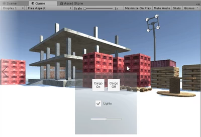
Your Scene should now look like this:
Go ahead and click Play and try clicking on each Interaction component. What happens?
The answer is nothing. Nothing should happen until we link the buttons to the objects in the Scene. Right now, the toggles will turn on and off and the slider will drag, but the objects in the Scene won’t react.
8. Add Functionality to the “Sun” Buttons
Link the bottom Sun buttons to the Directional Light (representing the sun) to turn it on and off.
1. Select both the Sun Off and Sun On buttons and make a new OnClick reference by clicking the + at the bottom of the OnClick component.
2. Drag in the Directional Light as a reference for both buttons. As a reminder, buttons use OnClick events to signal an action.
3. In the Inspector, set the Sun Off reference logic to GameObject.SetActive so we can turn the Directional Light off or on when we click the button On Click > GameObject > SetActive (bool). Be sure the toggle box is not checked. This ensures that the GameObject will be deactivated when clicked.
4. Repeat this step for Sun On, but be sure the toggle box is checked. Checking the bool ensures that the GameObject will be activated when the button is clicked.
5. Change each button’s text to represent its names: Sun On and Sun Off, respectively.
9. Add Functionality to the Sliders
Similar to the buttons, add functionality to the sliders so they control the colored lights’ intensities.
- To control the intensity of the Scene’s red light, follow the same steps with the Red Light Slider as with the buttons, but drag the Red Light GameObject into the reference.
- In the Inspector, set the logic to adjust the Light.intensity parameter so we can control the light’s intensity: On Value Changed > Light > Intensity.
- Increase the slider’s Max Value parameter to 10 and click Play to try out the slider. The red light’s intensity should fluctuate as you move the slider back and forth.
Explore — Increase or decrease the light's max value
The Red Light’s intensity is directly proportional to the slider’s value, so a Max Value of 20 will set the light’s intensity level to 20. Play around with this setting to see what feels right.
10. Add Functionality to Your Toggle Group
Set the colored lights as references to each toggle so you can turn each light on and off.
- Make a new On Value Changed event for each toggle.
- Assign each colored light to its respective toggle (e.g., Red Light added to Toggle - Red Light).
- Set the logic to Light.enabled, which dynamically turns the lights on and off at runtime.
- In your Hierarchy, select the Red, Blue, and Green lights, and disable their light components so the Scene starts with the lights turned off. Clicking the toggles will turn these lights back on.
11. Try Out the UI
Explore — Click Play and Try Your New UI
Give it a try yourself! All of the interactive components should now be fully functional, mouse responsive, and able to modify the lighting. If everything works, you've successfully designed and prototyped your first interactable UI!
Reminder: Interactive UI GameObjects respond to mouse and keyboard inputs by default. This means that your mouse can interact with the UI buttons, making it a great tool for a rapid prototyping and testing while using the Editor interface.
Read on to learn how to make these respond. We will now modify the UI interaction components so they respond to VR inputs as a last step before deploying to our VR devices.
12. Place the UI in 3D Space
Convert the UI panel from Screen Space to World Space so we can interact with toggles, buttons, and sliders with our controllers.
- In the Hierarchy, select the UI Canvas and convert the Render Mode from Screen Space to World Space.
- In the Hierarchy, select the Canvas and adjust its size to an appropriate scale. We found a scale of .002 to make sense. Adjust the Canvas to fit comfortably in front of the user.
- Reposition the UI menu so it sits above the platform and in front of the user. We found a position of (1, 1, -3) to make the most sense.
13. Download the Oculus Starter Pack (OSP) from the Asset Store
Download the OSP from the Asset Store so we can add the necessary scripts and Prefabs to make the scene VR-compatible.
- Open the Asset Store window in Unity (Window > Asset Store) or hit Ctrl + 9 (Windows) / Cmd + 9 (Mac).
- Search for and download the Oculus Sample Framework.
14. Replace the Camera With the OVRCameraRig Prefab
Locate the OVRCameraRig Prefab in the Prefab folder and replace the main camera in the Hierarchy so we have access to our VR controller
- In the Import pop-up menu, select None.
- Find and select OVRInspector (Oculus > SampleFramework > OVRInspector).
- Find and select VR (Oculus > VR).
In the Hierarchy, delete the Main Camera object and replace it with the OVRCameraRig Prefab (Assets > Oculus > VR > Prefabs). Note: Every VR-ready Scene using Oculus needs to use the OVRCameraRig Prefab instead of a Camera.
15. Replace the Standalone Input Module with the OVR Input Module
Replace the EventSystem’s input module with the OVR Input Module so we can interact with the UI menu with our controller and headset. To start, click on EventSystem in the Hierarchy.
- In the Hierarchy, click on the EventSystem GameObject.
- Remove the Standalone Input component and replace it with an OVR Input Module.
16. Set the Ray Transform to CenterEyeAnchor
Add the CenterEyeAnchor to the Ray Transform parameter so the EventSystem knows the origin point of our UI selection gaze.
- Under OVR Input Module, set the Ray Transform field to be the CenterEyeAnchor. This adjusts the UI so your gaze determines which UI interaction component is selected. In other words, you select a UI component with your gaze.
- Find the CenterEyeAnchor in the Hierarchy with OVRCameraRig > TrackingSpace > CenterEyeAnchor.
17. Replace the Graphic Raycaster Component with the OVR Raycaster Component
On your Canvas GameObject, add the OVR Raycaster component and remove the Graphic Raycaster so our UI can interact with rays coming from our headset and controller.
- In the Canvas Inspector, click Graphic Raycaster > Gear Icon > Remove Component.
- In the Canvas Inspector, select Add Component > OVR Raycaster. This enables your “selecting gaze,” or, in other words, your pointer.
18. Set the Event Camera Field to CenterEyeAnchor
On your Canvas GameObject, set the Event Camera field on the Canvas to the CenterEyeAnchor (OVRCameraRig > TrackingSpace > CenterEyeAnchor).
- In the Hierarchy, click on Canvas.
- In the Canvas Inspector, drag the CenterEyeAnchor into the Event Camera slot (OVRCameraRig > TrackingSpace > CenterEyeAnchor).
19. Add the GazePointerRing Prefab to Your Scene
Drag the GazePointerRing Prefab into the Hierarchy so it tracks where we look. This acts as a “VR cursor" — an indicator of where we are looking on the UI menu.
- In the Project window, find the GazePointRing Prefab (Assets > Oculus > SampleFramework > OVRInspector > Resources > Prefabs).
- Drag the GazePointRing into the Hierarchy. Note: Interestingly, we only need to drag the ring into the Hierarchy. Once it's in the Scene, our OVRCameraRig finds the object and uses it as a “VR cursor.”
20. Key Takeaways
Congratulations! You made it, and you now know how to build an interactable UI, test and prototype functionality, and convert it to a VR-ready UI menu. Note that because we depended upon features from the Oculus VR SDK for Unity, this VR-ready UI is set up to use only with Oculus.
Your Scene is ready to try in VR. Go ahead and build to your Oculus Go and try out the UI you just created.
(Note: The lights in the photo above are enabled. A previous step had us disable them, so do not be alarmed if you do not see the colored lights in your final scene.)
If you have an Oculus Rift attached to your computer, you can test your Scene out right in Unity by pressing the play button.
--------------------
You've now made a fully interactive user interface. You used Unity’s built-in design tools to build a simple, clean UI to adjust the Scene’s lights. You also interacted with this UI using Vive controller input.
By completing this module, you’re now able to:
- Modify Scene lighting by setting them as UI references.
- Automatically align UI components using Unity’s auto layouts features: Horizontal Layout, Vertical Layout, Grid Layout.
- Interact with these objects using the VR controllers.