
Labeling Objects Using User Interfaces
Tutorial
Beginner
+10XP
30 mins
Unity Technologies
In this tutorial, you will build an interactive UI panel prototype to control GameObjects in the Scene.
Languages available:
1. Overview
Why User Interfaces?
This tutorial provides an introduction to User Interfaces in Virtual Reality. A User Interface (UI) is fundamentally a communication tool. It acts as the control panel between the user and a technology, or as a messaging tool, informing the user about certain features. In essence, the UI communicates information about an application and unlocks new features and abilities.
By the end of this tutorial, you will be able to:
- Add descriptive UI objects (images, text, lines) to the 3D Scene.
- Use the UI to label objects in the Scene.
This tutorial will walk you through the steps needed to build an informational bulletin board and explain how you can use UI elements to label objects in 3D space.
To create a labelled bulletin board, you will need to:
- Add a header label at the top of the board
- Add text to finish the label
- Add blueprint and house images to your bulletin board
- Connect features of the house to the blueprints with the Line Renderer
2. Add a Header Label at the Top of the Board by Adding an Image.
You will add an Image to the Scene and color it brown. This image indicates where we will add the white header text naming the board “Planning Board.”
--------------------
Add the title's background.
1. Create an Image as a child of the Planning Bulletin Board GameObject by right-clicking it in the Hierarchy and navigating to/clicking Create > UI > Image or Right Click > UI > Image. This automatically generates a parent Canvas.
2. Rename the new Canvas Title - Canvas and the image Planning Board - Image.
--------------------
What is an Image?
An Image is one of the most common visual components used with UI. It has certain parameters that allow you to further customize the object.
- Source Image: This parameter houses the photo used in the Scene. To do so, we upload a Sprite (image) to USource Image: This parameter houses the photo unity and then drag it into the Source Image.
- Color: This parameter adjusts the chromatic tint of the image. In the event there is no image, the image will render as the specified color.
- Material: We can overlay a material on the image. To learn more about Materials, please review the Materials Module.
What is a Canvas?
A Canvas is like a blank whiteboard that holds all of the visual components (images, text, etc.). Every UI element must have a Canvas as the parent. This is how Unity holds all of the GameObjects together as a single user interface.
When you create a new UI element, it automatically creates a Canvas as the parent — if there isn’t already a Canvas in the Scene.
If a UI object does not have a Canvas as a parent, it will not be visible in the Scene.
--------------------
Locate the new Canvas in the Scene View and convert it to World Space. Adjust the positioning of both the new Canvas and Image to fit the Bulletin Board.
1. Double-click on the Title - Canvas GameObject in the Hierarchy to bring focus to it in the Scene view. Alternatively, you can press F on the keyboard while your mouse is hovering over the Scene view and Title - Canvas is selected.
2. In the Inspector, change the Canvas' Render Mode from Screen Space - Overlay to World Space, moving the UI into 3D space (World Space) and enabling us to place the sign on the wall. (Note: The Canvas and Image are still huge. They hold their default Rect Transform values despite switching render modes.)
3. Reset the Rect Transform component of the Canvas in the Inspector by clicking on the cog located at the top-right corner of the component and selecting Reset. Set its Pos Z to -0.71, Width to 0.95, and Height to 0.95.
4. Reset the Rect Transform component of the Image, as well, using the same method as in the previous step. Adjust its Width and Height to allow for new text. Adjust its Pos X and Pos Y in a manner that positions the Image at the top-left corner of the bulletin board.
--------------------
What is Render Mode and World Space?
Render Mode refers to where and how the UI exists in the Scene (in 2D or 3D space). The UI can be placed in one of three Render Modes:
- Screen Space (Camera) - the Canvas is drawn in 2D, and always remains in view.
- Screen Space (Overlay) - the Canvas is drawn in 2D, staying within a specific proximity to the camera.
- World Space - the Canvas is drawn in a 3D placement anywhere in your scene
--------------------
Change the image’s color to brown to match the board’s frame.
- Change the Image’s Color. We chose brown to match the board (you can input a hex value of #7E6B3EFF).
3. Add Text to Finish the Label
Add a Text GameObject. With white copy, title the board “Planning Board” and adjust the position/size with the Rect Transform/Anchor Presets components.
1. Right-click on the Planning Board - Image GameObject and select Create > UI > Text.
2. Change the Text copy by replacing “New Text” with “Planning Board.”
3. Use the Anchor Point presets in the Text's Rect Transform to center the text to the Image (Anchor Presets > Middle-Center).
4. Increase the Font Size of the Text while decreasing the Rect Transform's Scale to increase the text’s clarity. We recommend increasing the Font Size to 100.
5. Adjust the Text's Paragraph Parameters to match the values as shown in the image below.
--------------------
What is Text?
The Text component controls the text displayed on your user interface, whether this is a button label or a full message.
Text has certain features which are essential for customizing your UI:
- Font Type
- Font Style
- Size
- Line Spacing
- Alignment
- Vertical Overflow
- Horizontal Overflow
What is Vertical Overflow?
The Overflows are similar to “Text Wrap” in Google Sheets or Microsoft Office, which defines the UI’s behavior if the text doesn’t fit on a single line. The Text will either continue on one line or wrap down to the following lines, depending on the size of the text and the Width of the Text box.
- Truncate pushes the text to the next line
- Overflow enables the text to stay on one line, rather than wrapping to the next.
What is Rect Transform Component?
The Rect Transform is the coordinate system for UI objects. We use this to change the position, scale, and rotation of UI objects in the scene.
The Rect Transform is similar to the regular Transform Component. Whereas a standard Transform represents a single point in the 3D environment, a Rect Transform represents a rectangle that a UI element is placed inside.
Width and Height specify the size of the rectangle that the UI objects sits in.
What are Anchor Point Presets?
The Anchor Point Presets are alignment tools in the Rect Transform. A UI object can be aligned with the corners or sides of its parent object, making for precise positioning.
Additionally, Anchor Points are a critical ingredient in responsive UI. The Anchor Point locks the UI to that specified area of the Canvas. If that area of the Canvas moves, so will the Anchor Point, and subsequently the anchored UI GameObject.
Explore - Learn more about the Rect Transform
Reinforce the differences between adjusting the Canvas Rect Transform vs. the Image Rect Transform.
- Adjust the UI to different Widths, Heights, and Positions to see how it affects the Image.
- Notice how modifying the Canvas will modify the image as well?
- If you modify the Image, it will have no effect on the Canvas. This speaks to the Parent/Child relationship, as modifying the parent affects both the parent and all children underneath.
Tip - Increase Text Clarity
Increasing font size and decreasing scale is a trick to increase font clarity. As the font increases, so does the number of pixels used to render the text. By decreasing the scale, we increase the pixel density.
Tip - Order in the Hierarchy Matters!
The order of GameObjects in the Hierarchy matters! If the objects are in the exact same position, the lowest-order object will render first.
Take a moment to place the Planning Board - Image object below the Text object. Notice how the Text object disappears. The Planning Board renders over the Text!
4. Add Blueprint and House Images to Your Bulletin Board.
Add the blueprint and color house images to the bulletin board and position them accordingly.
Add an image to your scene, adjust its size to fit the bulletin board, and position it in the middle of the board.
1. To display the house photo, add a new Image and position it in the middle of the board (Create > UI > Image)
2. Scale the Image and place it in the center of the board by reducing the scale of the image to approximately .02 on both the X and Y Scale.
--------------------
Duplicate the image three times, reduce the scale, and place the new images around the board.
1. Duplicate the Image you created for the house three times using Ctrl + D (Windows)/Command + D (Mac). Reduce the new images’ scales to approximately half the size of the original image.
2. Distribute the new photos around the board by repositioning them in the Scene view or adjusting their Rect Transforms in the Inspector.
--------------------
Add the Sprite of the house to the center, and add the blueprints to the duplicated images
1. Drag and drop the house Sprite (Assets > Images > House Photo.jpg) to the center Image GameObject's Source Image property.
2. To display the blueprint images (Assets > Images > Blue Print.jpg), select the duplicated images and add the blueprint Sprites to their Source Image parameters like in the previous step.
--------------------
What is a Sprite?
Unity refers to photos or images as “sprites.” Unity defines Sprites as 2D graphic objects. Conceptually a Sprite is an image or photo, however it is important to Unity’s workflow in mind, and that we add Sprites to Image GameObjects to render them in a scene.
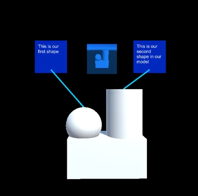
5. Connect Features of the House to the Blueprints with Three Line Renderers
Add a Line Renderer object as a child of a blueprint,and add a new Material to adjust the line’s color.
1. Add a Line Renderer GameObject as a child of the first blueprint image. Reset the Transform component by clicking on the cog in the top-right corner of the Component and clicking Reset.
2. Change the Line’s color by adding the Material LineRenderer to the Material parameter. (Assets > Materials > LineMaterial).
--------------------
What is a Line Renderer?
A Line Renderer draws a line between multiple points in 3D space.This is very helpful when you need to add lines to connect multiple objects in the scene.
You can adjust the Line Renderer’s Width, Material, Color, Transform values, and the line’s points’ positions.
You can also adjust the point positions to sit in World Space or Local Space, which determines if the point positions are relative to the entire scene or only its parent GameObject.
--------------------
Adjust the second Element’s parameters to connect the line to the House Photo.
1. In the Line Renderer Component, adjust the Positions property's Element1 parameter so the line points towards the colored photo.
2. Adjust the Line Renderer’s Width to a more appropriate size. We chose .03.
3. Add second and third Line Renderers by repeating the previous steps. Adjust their Element parameters so the lines point from parent blueprint to the house image. Remember to reset their positions before making any adjustments!
6. Key Takeaways
You’re now ready to add signs and lines to your projects. In this tutorial, you setup different UI elements as labels in the Scene and demonstrated their relationships to each other using lines.
Be sure to use this technique when building out labels for different parts or objects. Feel free to continue exploring the visual components by making new Canvases, adding text and images, and bringing in Sprites of your own.
By completing this tutorial, you’re now able to:
- Label Scene objects with images and text.
- Indicate their references with the Line Renderer.