
Interactive UI Menus
Tutorial
Beginner
+10XP
30 mins
(37)
Unity Technologies
In this tutorial, you will lean how to create a UI control panel to adjust Scene lighting.
Resources
1. Overview
In this tutorial, you will lean how to create a UI control panel to adjust Scene lighting. You'll also learn how to add interactable UI to manipulate lights in the Scene.
To do so, you’ll need to:
- Create a UI Canvas and add buttons, a slider, and a toggle group
- Consolidate these components onto one UI panel and organize them with the Canvas layout component.
- Make the UI responsive by configuring the Anchor Points and setting the Canvas Scaler
- Make the interactive components functional using mouse inputs
- Deploy to your UI to your smartphone to test functionality.
2. Create a UI Canvas and Add Interactable Components
Create a menu with a UI Canvas to hold all of our interactable UI components — such as buttons and sliders — by adding a panel to the Scene.
- Create our interactable components (Create > UI > Canvas).
- To make the UI’s background, add a panel as a child of the Canvas (Create > UI > Panel).
- Select the color of your preference for the panel. We chose a light, slightly transparent blue (HEX color #00565A64).
Tip — UI Components Need a Canvas to Render
All UI elements need a Canvas as a parent. It's best practice to make a Canvas first and then add all of the required UI elements as children.
3. Add Buttons to Your Panel
Add light control functionality to your panel by adding a new Canvas and two buttons to turn the sun on/off.
- In the Hierarchy, create a UI Canvas to hold the two buttons (Create > UI > Canvas).
- Place the Canvas in the center of the original Canvas and rename it Button Canvas - Horizontal.
- In the Hierarchy, add a button to the new Canvas (Create > UI > Canvas) as a child of the Canvas.
- Position the button in the center of the Canvas and name it Sun Off.
- Duplicate the button, name it Sun On, and adjust the two buttons’ positions so they sit at the bottom of the Canvas panel.
--------------------
What is a Button?
The most common interactable UI element is a Button. A button has a single event called On Click that responds when the user “clicks” the button. An Event is Unity’s method for tracking specific occurrences. When Unity’s UI system recognizes a click event, or OnClick, it responds according to our specified logic.
Tip — Button Colors
Adjust the color properties of a button to indicate different states (normal, pressed, disabled). The colors will indicate if the button is ready to be pressed (normal), pressed (being clicked), or disabled (no longer clickable).
4. Align Buttons with a Horizontal Layout
Align the new buttons with the Horizontal Layout tool.
- Add the Horizontal Layout Group to Button Canvas - Horizontal.
- Adjust the padding/spacing until the buttons are aligned in the middle. (Hint: Review the Rect Transform values below.)
What are Horizontal, Vertical, and Grid Layout Groups?
The Horizontal Layout Group is an auto-spacing tool, and arguably one of the most important tools when designing beautiful UI, since it automatically adjusts each GameObject’s positioning based on defined parameters, such as spacing, padding, and height. There are multiple types of layout groups: Horizontal, Vertical, and Grid. The Horizontal Layout Group places its child objects next to each other.
The Vertical Layout places them on top of each other.
The Grid Layout places the objects in a grid, with a predetermined number of rows and columns.
Automatically spacing UI elements substantially increases the quality of your UI design by evenly distributing UI elements, and in turn expedites the UI development process. With these tools, you will no longer need to approximately adjust and “pixel push” the positioning of your UI elements.
Read more on the Canvas Auto-Layout components in the Unity documentation.
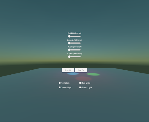
5. Add Sliders to Control the Light Intensity
Add a UI component called a Slider to manipulate the intensity of each colored light in the Scene. Adjust the Slider’s spacing by adding a Vertical Layout Group component to the parent Canvas.
- In your Hierarchy, add a new Canvas and call it Red Light Intensity to distinguish its slider’s functionality.
- Add a second Canvas and call it Slider Canvas - Vertical (Create > UI > Slider). This Canvas will hold all of your sliders and will automatically align them vertically.
- In the Hierarchy, add a Text GameObject to label the new slider (Create > UI > Text). Approximately match the alignment of the text to the slider (shown below) so the text sits on top of the slider. Be sure to adjust the text’s size, scale, alignment, overflow, and position. These details are important when designing a well-polished user interface.
- Change the text, then duplicate this slider four times. Change each new slider’s text to its respective functionality.
- In Slider Canvas - Vertical’s Inspector, add the Vertical Layout component to the parent Canvas and adjust the spacing and padding to align the slider group in the middle of the screen.
What is a Slider?
The Slider is an interactable UI feature that has a decimal number value that the user can set by dragging between a minimum and maximum value. It can be either horizontal or vertical. By sliding the dot across the track, from left to right, you increase the slider’s value. Conversely, dragging from right to left decreases the value. A real-world example is a dimmer on a light switch.
6. Add Toggle Buttons to Turn On/Off the Colored Lights
Add a Toggle Grid and space the toggles evenly with the Grid Layout Group component so to turn each light (red, blue, purple, green) on and off.
- Create a new Canvas as a child of the first Canvas and name it Toggle Canvas - Grid. This Canvas will hold all of our toggles' GameObjects, which is important when we align them as a grid.
- Add four Toggle buttons (one for each colored light).
- Change the text labels on all four Toggle Groups to Toggle - Red Light, Toggle - Blue Light, Toggle - Green Light, and Toggle - Purple Light.
- Make the font more legible by increasing the size and decreasing the scale. Change the copy to reflect each toggle’s name.
- Automatically align the toggles by adding the Grid Layout component to the parent Canvas, Toggle Canvas - Grid. Adjust the padding and spacing so the toggles are positioned in the bottom third of the Canvas and locked into a 2x2 grid (see below).
--------------------
What is a Toggle?
A Toggle has a checkbox that determines whether it's on or off. This is a helpful tool for activating and deactivating particular elements of a Scene, such as lights.
7. Connect the Toggles with a Toggle Group
Connect each toggle with a Toggle Group so you can turn each of the four colored lights on, one at a time.
- Create an empty GameObject, name it Toggle Group, and add a Toggle Group script component.
- Drag the Toggle Group GameObject into each toggle’s Group parameter in the Inspector. By creating the Toggle Group reference, each toggle knows when the other toggles are turned on or off. Remember that only one option in the Toggle Group can be selected at a time.
- In the Inspector for each toggle, turn off the Is On parameter so the lights will be on when the toggle boxes are checked and off when unchecked.
--------------------
What is a Toggle Group?
A Toggle Group can be used to group a set of Toggles that are mutually exclusive. Toggles that belong to the same group are constrained so that only one can be selected at a time. Selecting one automatically deselects the others.
We will implement a Toggle Group below:
Selecting “Wizard” will automatically deselect “Warrior” and “Thief,” as only one toggle in a Toggle Group can be selected.
Explore — Try Clicking on Each Toggle
Your Scene should now look like this:
Go ahead and click Play and try clicking on each Interaction component. What happens?
The answer is nothing. Nothing should happen until we link the buttons to the objects in the Scene. Right now, the toggles will turn on and off and the slider will drag, but the objects in the Scene won’t react.
8. Add Functionality to the Sun Buttons
Link the bottom Sun buttons to the Directional Light (representing the sun) to turn it on and off.
- Select both the Sun Off and Sun On buttons and make a new On Click reference by clicking the + at the bottom of the On Click component.
- Drag in the Directional Light as a reference for both buttons. (As a reminder, buttons use On Click events to signal an action.)
- In the Inspector, set the Sun Off reference logic to GameObject.SetActive so we can turn the Directional Light off or on when we click the button: On Click > GameObject > SetActive (bool). Be sure the toggle box is not checked. This ensures that the GameObject will be deactivated when clicked.
- Repeat this step for Sun On, but be sure the toggle box is checked. Checking the bool ensures that the GameObject will be activated when the button is clicked.
- Change each button’s text to represent its name: Sun On and Sun Off, respectively.
--------------------
What is an Event System?
Unity’s Event System is a communication tool that keeps track of everything that's clicked on and everything that needs to happen when something is clicked. Think about it this way:
- We flip on a light switch. This is the “event.”
- The EventSystem carries a message saying, “Hey, this particular event just happened. Turn the light on!”
- The Light GameObject hears this message and turns on the light.
The EventSystem keeps track of what is clicked and sends the message from the UI to Unity when an interactive UI object is clicked or modified.
9. Add Functionality to the Sliders
Similar to the buttons, add functionality to the sliders so they control the colored lights’ intensities.
- To control the intensity of the Scene’s red light, follow the same steps with the Red Light Slider as with the buttons, but drag the Red Light GameObject into the reference.
- In the Inspector, set the logic to adjust the Light.intensity parameter so we can control the light’s intensity: On Value Changed > Light > Intensity.
- Increase the slider’s Max Value parameter to 10 and click Play to try out the slider. The red light’s intensity should fluctuate as you move the slider back and forth.
--------------------
Explore — Increase or decrease the light's max value
The Red Light’s intensity is directly proportional to the slider’s value, so a Max Value of 20 will set the light’s intensity level to 20. Play around with this setting to see what feels right.
10. Add Functionality to Your Toggle Group
Set the colored lights as references to each toggle so you can turn each light on and off.
- Make a new On Value Changed event for each toggle.
- Assign each colored light to its respective toggle (e.g., Red Light added to Toggle - Red Light).
- Set the logic to Light.enabled, which dynamically turns the lights on and off at runtime.
- In your Hierarchy, select the Red, Blue, and Green lights, and disable their light components so the Scene starts with the lights turned off. Clicking the toggles will turn these lights back on.
11. Make your UI Responsive
Configure the Canvas’ anchors with the Anchor Presets and the Canvas Scaler so the UI stays in the center of your screen, regardless of the screen size.
- In the Hierarchy, select Button Canvas - Horizontal.
- In the Inspector, click the Anchor Preset box and select the center option.
- Select Slider Canvas - Vertical and repeat the second step by selecting the center option.
- Repeat this step one more time with Toggle Canvas - Grid, but select the bottom anchor option.
- Select the parent Canvas and change the Canvas Scaler to Scale with Screen Size so the interactive components scale as the screen becomes smaller or larger (important when building UI for multiple screen resolutions).
--------------------
What are the Anchor Presets?
Anchor Presets are a quick way to set your anchor Min and Max values. As your screen size changes, the object will stay fixed to the defined anchor on the UI. In this case, we set the defined anchor as the center of the UI. Now the interactable features will always be in the center of the screen, except for the toggles, which were anchored to the bottom of the Canvas.
Examples of the UI anchoring system:
What is the Canvas Scaler?
Modern applications often need to support a wide variety of screen resolutions. UI layouts in particular need to be able to adapt. This means buttons should become smaller by the same percentage as the screen is smaller. In other words, the scale of the buttons should follow the screen size. This is where the Canvas Scaler component can help.
The UI system in Unity includes a Canvas Scaler, which controls the size and pixel density of your UI as the screen resolution increases or decreases.
The Canvas Scaler can be added to a root Canvas — a GameObject with a Canvas component on it, of which all UI elements are children. It's also added by default when creating a new Canvas through the GameObject menu.
In the Canvas Scaler component, you can set its UI Scale Mode to Scale With Screen Size. With this scale mode, you can specify a resolution to use as reference. If the current screen resolution is smaller or larger than this reference resolution, the scale factor of the Canvas is set accordingly so all the UI elements are scaled up or down with the screen resolution.
One thing to be aware of: After adding a Canvas Scaler component, it’s important to also check how the layout looks at other aspect ratios. By setting the resolution back to Phone HD landscape, we can see that the buttons now appear bigger than they should.
12. Place the UI in 3D Space
Convert the UI panel from Screen Space to World Space so we can interact with toggles, buttons, and sliders with our controllers.
- In the Hierarchy, select the UI Canvas and convert the Render Mode from Screen Space to World Space.
- In the Hierarchy, select the Canvas and adjust its size to an appropriate scale. We found a scale of .002 to make sense. Adjust the Canvas size to fit comfortably in front of the user.
- Reposition the UI menu so it sits above the platform and in front of the user. We found a position of (1, 1, -3) to make the most sense.
--------------------
Explore — Click Play and Try Your New UI
Give it a try yourself! All of the interactive components should now be fully functional, mouse responsive, and able to modify the lighting. If everything works, you've successfully designed and prototyped your first interactable UI!
Reminder: Interactive UI GameObjects respond to mouse and keyboard inputs by default. This means that your mouse can interact with the UI buttons, making it a great tool for a rapid prototyping and testing while using the Editor interface.
13. Key Takeaways
Congratulations! You've now made a fully interactive user interface. You used Unity’s built-in design tools to build a simple, clean user interface to adjust the Scene’s lights. You also interacted with this UI using Vive controller input.
By completing this tutorial, you’re now able to:
- Modify Scene lighting by setting lights as UI references
- Automatically align UI components using Unity’s auto layouts features: Horizontal Layout, Vertical Layout, and Grid Layout
- Interact with these objects using the VR controllers
Continue putting your new skills to the test and challenge yourself to build a UI panel for an automotive design application.