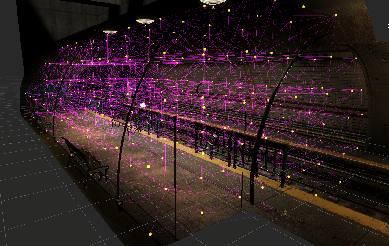
Subway Daylight and Horror
I decided to create two separate post processing volumes at opposite ends of the spectrum -- a positive, open daylight feel and a foreboding, cramped horror theme. Both themes used a physically based sky with the same setup -- I wanted to be able to change the tone without drastically changing the sky or directional lighting in a scene. The daylight theme used bloom with a soft blue tint and low intensity (.15) while the horror theme used a bit more intensity (.5), a yellow tint, and a lower quality. Despite daylight generally using warmer colors and horror using cooler colors on the greener side, the color swap on bloom seemed to help. Both used Depth of Field, Motion Blur, and some color / exposure changes. Horror had much less saturation and exposure and much higher contrast. Horror also used a light film grain and lens distortion effect. Both had a vignette, but daylight was very subtle. The daylight scene could have been a bit brighter, but I found when I increased the lighting it looked out of place due to the general grungy nature of the textures. Because of this I compensated with an overall warmer tone. Split Toning did a surprisingly large amount of lifting for the Daylight scene. I made the shadows a slightly darker grey and highlights a pure white, while shifting the balance to just below 11. This allowed me to have a saturated, warm yellow tone to the scene that was bright but not overpowering. Removing color adjustments left the scene feeling more grey/brown. Subtle changes to Lift, Gamma, and Gain allowed me to compensate for my guesstimating to get a more accurate color feel for the daylight subway. Volumetric Fog had the most impact on the horror scene. It looks decidedly better WITHOUT the fog, but the feel is off. The entire scene felt very metallic and sterile -- more like a laboratory setting with the lights off than a grungy subway. Adding fog helped with the tone of the scene instantly, but non-volumetric fog felt "cheap". While it helped with the cramped tone it brought me reminders of playing old N64 games. Volumetric fog felt naturally claustrophic and helped play well with the lighting setup. This was a pretty good series to do as it gives you a strong baseline on how to use an existing asset pack.