
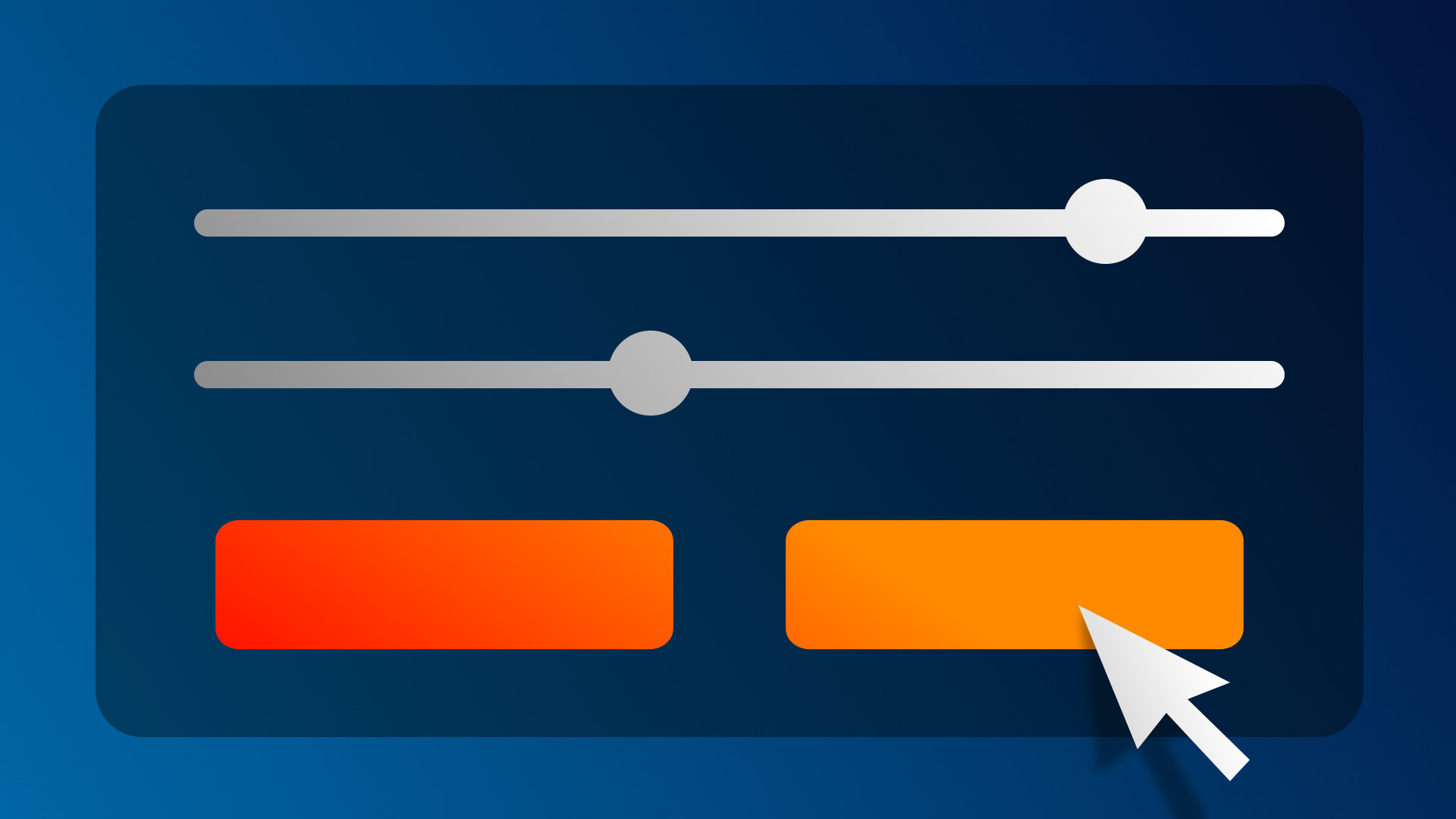
Manage screen size and anchors
Tutorial
Beginner
+10XP
30 mins
(675)
Unity Technologies
You can spend a ton of time making your UI look perfect on your screen, but what happens if someone opens your application on a screen with a different size or a different shape? In this tutorial, you’ll learn how to consider the screen’s aspect ratio and use Canvas Anchors to make sure your UI elements stay where you want them to.
By the end of this tutorial, you'll be able to:
- Preview different aspect ratios for your project.
- Understand the role of the Canvas GameObject in designing a UI.
- Position 2D elements on screen by using the Rect Transform component and Rect tool.
- Control how UI elements scale, rotate, and reposition relative to other objects on screen by editing the anchor and pivot points.
- Anchor a UI element to different parts of a Canvas by using presets and by positioning it manually.
- Control how the entire UI responds to changes in screen resolution by understanding different Canvas Scaler modes.
Languages available:
1. Overview
With your title, you explored some basic text formatting. But how will that text respond to changes in screen size or shape?
Luckily, there are lots of tools available in Unity to help you with this.
In this tutorial, you will use Unity’s Canvas and Anchor Point system to make sure your UI elements always appear in the right place, regardless of the screen they’re on.
2. Arrange the Editor for working with UI
When making edits to your UI, it’s helpful to see both the Scene view and Game view at the same time.
1. Rearrange the Unity Editor layout so that both the Scene view and Game view are on top of each other. From the Layout selector, the 2 by 3 option will work – or you can customize your own layout like the one shown below.
2. In the Hierarchy, double-click the Canvas GameObject to frame it in Scene view. Your perspective will zoom way out to reveal a gigantic 2D rectangle, your 3D scene now appearing tiny next to the bottom-left corner of the Canvas.
If you don’t see the rectangle’s outline, you may have to enable Gizmos in the Scene view.
This rectangular Canvas represents the screen that your final project will be viewed on – all UI elements must fall within the rectangle to be viewable on screen.
3. In the Scene view, enable 2D mode.
Since your Canvas is only two dimensional, 2D mode allows for the simplest editing, restricting movement to only the X and Y dimensions. To exit 2D mode, just select the 2D button again.
3. Select an aspect ratio
What is an aspect ratio?
Now that you can actually see the outline of the screen (the Canvas), lets set the shape – or aspect ratio - of that screen.
The aspect ratio describes the relationship between the width and the height of a screen.
Old-fashioned TVs and the very first films, for example, used a 4:3 aspect ratio. That means that the screen was 4 units wide and 3 units high. However, modern widescreen TVs and most new films use a wider 16:9 aspect ratio.
Lock your project’s aspect ratio
Unity allows you to choose which aspect ratio you want to use for your Canvas.
1. In the Game view, use the screen resolution dropdown to select Free Aspect.
This means that the screen is free to change its aspect ratio.
With Free Aspect enabled, the Canvas will change in shape and size as you resize the Game View window. This can be helpful for testing if you’re trying to make sure your scene looks good on screens of different shapes.
2. Move the edge of your Game view window to make it narrower and wider. Notice that the Canvas in the Scene view changes freely to reflect the size and shape of the Game View window.
You will also notice that your text likely moves off-screen as you do this – that is a good demonstration of how difficult it is to design experiences that are responsive to different screens. To keep things simple, we are going to stick with a single shape (or aspect ratio).
3. In the Game view, use the screen resolution dropdown to select either the 16:9 or 16:10 aspect ratio.
16:9 is the standard widescreen ratio, so it’s the safest option. Designing for a single predetermined aspect ratio will make designing your UI a lot easier.
With a fixed aspect ratio, you’ll now notice that changing the width or height of your Game view window will not affect the aspect ratio of the Canvas in the Scene view.
You now have your Canvas and aspect ratio set up perfectly, ready to add more UI elements.
4. Add a settings button in the corner
To be able to access the settings screen, you’ll need a settings button.
1. In the Hierarchy right-click > UI > Button - TextMeshPro. This will add a button somewhere on your UI as a child of the Canvas GameObject.
2. In the Hierarchy, rename the “Button” as “Settings Button”.
3. Expand the Settings Button GameObject and select its Text (TMP) child GameObject. This is a Text Mesh Pro element just like your title. Change the text to say “Settings” and edit the style to match your title.
4. Use the Move tool to position the button in one of the corners of your Canvas, still leaving space for margins between the button and the edge of your screen. Choose whichever corner looks best in your scene.
5. What are anchors?
Why do you need anchors?
You carefully positioned your settings button in a desirable corner location.
However, if you move the edge of the Game view window, increasing or decreasing the size of the screen, the button will drift towards undesirable locations.
If the screen is too small, the settings button will drift off the screen.
If the screen is too large, the settings button will appear too close to the center.
This movement is controlled by the Canvas’ anchor system. Every UI element on the Canvas is anchored to a particular position on its parent object – and it will move relative to that position when the screen size changes.
Visualize the anchors
From the Scene view toolbar, select the Rect tool (or press T on your keyboard when in the Scene view) and then select your Settings Button object.
With the Rect tool selected, you will be able to see the four corners of your button’s Rect Transform, represented by blue circles.
You will also see the anchor in the middle of the screen, represented by four small triangles pointing inward.
Note: in the image above, the title and skybox have been disabled to help you see the anchors more clearly.
The button will always stay the same distance from that anchor; it doesn’t matter how big or small the screen is. Test this for yourself by resizing your Game view window.
Here’s the position of the settings button relative to the center of the screen when the Game view is very small. The button would be off-screen:
Here’s the position of the settings button relative to the center of the screen when the Game view is a normal size. The button would be in the corner:
Here’s the position of the settings button relative to the center of the screen when the Game view is very large. The button would be too close to the center:
Each blue circle surrounding the button actually corresponds to one of the four individual triangles making up the anchor.
This allows you to control the four corners of the anchor independently, but that is a bit beyond the scope of what we’re trying to do here.
6. Set the anchor for the settings button
Anchoring the title to the center of the screen is probably OK, since it should stay close to the center of the screen.
The settings button, on the other hand, should stay in the corner. Therefore, it should be anchored to the corner of the screen.
1. With the Settings Button selected, use your cursor to select the center of the anchor, then move it to the corner nearest to your button. Be careful not to grab any of the individual corners of the anchor — click directly in the center to move them all.
2. Try resizing the Game view window now. The button should stay the same distance from the corner of the screen instead of the center of the screen.
To save you the time and effort of moving anchors around and to help you be more precise, Unity has anchor presets that you can use.
3. With the Settings Button object still selected, in the Rect Transform component, select the Anchor Presets icon.
This will bring up the Anchor Presets:
4. Select the various anchor presets and notice how the position of the anchor changes in the Scene view. Experiment by resizing the Game view window with different anchor presets, trying to find the one that works best for you.
7. What are pivot points?
You may have noticed that, at the top of the Anchor Presets menu, it says, Shift: Also set pivot.
Holding the Shift key while setting an anchor preset allows you to set the pivot point of the object at the same time.
Position, scale, and rotation all happen relative to the pivot. As you design more advanced UI layouts, working with pivots can be pivotal. For now, just being aware of them is helpful in case a UI element is not behaving as expected.
To learn more about anchor points, pivot points, and how they can be used to create a more dynamic and responsive UI, check out the UI Manual.
8. Explore: Experiment with canvas scaling
As you were designing your UI, you may have noticed that as you scaled the size of the Game view resolution up and down, the UI took up proportionally different amounts of the screen.
At higher resolutions, the UI looks proportionally smaller, but at lower resolutions, the UI looks proportionally bigger:
This has to do with the Canvas Scaler: a component that controls scale and resolution of your UI elements at different screen sizes.
1. Select the Canvas object and locate the Canvas Scaler component. Notice that the UI Scale Mode property is set to Constant Pixel Size by default.
With a constant pixel size, your UI elements will take up the same number of pixels, regardless of the overall size of the screen. This might be helpful if you expect someone to experience your scene on a very low resolution device – the text will likely still be readable.
2. Set the UI Scale Mode to Scale with Screen Size. This mode will scale UI elements proportionally to the screen resolution. The elements will take up the same proportion of the screen, regardless of resolution.
By default, the Canvas Scaler will match the width of the screen, using 800x600 as the reference resolution.
This may have increased or decreased the relative size of your UI in the Game view.
3. Increase or decrease the X (width) of the reference resolution to get your UI elements to a desirable relative size on your screen.
There are advantages to each type of UI scale mode:
- Scale with Screen Size will guarantee that all UI elements are positioned in the same relative position, regardless of screen size.
- Constant Pixel Size will make sure that UI elements are always the same number of pixels.
- Constant Physical Size will try to make UI elements take up the same physical size by also taking into account the device’s dots per inch (DPI).
4. Select either Scale with Screen Size or Constant Pixel Size for your UI Scale Mode.
9. Next steps
In this tutorial, you selected an aspect ratio, added a new settings button, and made sure all your UI elements were anchored appropriately. In the next tutorial, you will begin work on the settings menu using images.