
Working with UI in Unity
Tutorial
Beginner
+10XP
1h
(595)
Unity Technologies
In this tutorial, you will learn:
- Teach how to put Anchor buttons to sides and adjust their width and height
- Teach how to put Anchor UI Text to the top-center of the Canvas and adjust the screen width
- How to use the anchor presets to lock UI elements to corners and sides of the UI menus
- Teach how to use the Canvas Scaler to automatically adjust the menu size based on different screen sizes
- Teach how to add the Canvas Scaler to Canvas
- Teach how to use the Canvas Scaler’s settings to scale the Canvas appropriately with different screen sizes
Languages available:
1. Getting Set Up
When working with User Interface (UI) GameObjects in Unity, you are able to customize how UI images appear on the screen using Anchor and Pivot points. UI elements such as background images, buttons, and text are commonly displayed within a menu shown at the beginning of a game. They can be set up to scale or stretch to an established position within a canvas. Additionally, the placement of UI elements can proportionately adjust with changing window sizes or aspect ratios. These UI features enable developers to create content targeted to multiple or various device screen sizes, as well as to simply keep UI elements visibly framed and organized within the Game view.
In order to get set up with UI Elements in Unity, you will first need to either open up an existing project or create a new project using any of the templates through the Unity Hub. In this tutorial, you will get set up with a newly created empty Scene in a Universal Render Pipeline (URP) Project. You will create a simple menu canvas screen with a background image, a title, and some menu buttons. To start, begin by creating a new URP project.
1. From the Unity Hub, select the New button. Type in a name for your project in the Project Name field in the Create a new project with Unity popup window. Next, select the Universal Render Pipeline button from the Templates menu, and then select the Create button.
The newly created Project will open, displaying its default example Scene.
2. From the top menu dropdown, select File > New Scene to create a blank Scene.
3. From the top menu dropdown, select File > Save As to give your Scene a name. Type in a name, and then select the Save button.
You are now ready to add a UI Background Image.
4. From the top menu dropdown, select GameObject > UI > Image to add a new image to the Scene.
When adding the new image, a new Canvas and EventSystem GameObject are also automatically added and are now visible in the Hierarchy window. The newly created image is placed within the Canvas GameObject. A white rectangular frame in the Scene represents the visible boundaries of the Game window.
5. In order to set the size and position of the UI Image, select the Rect Tool in the top left toolbar. Also, when working with UI elements, ensure that the Toggle Tool Handle Position button is set to Pivot, and the Toggle Tool Handle Rotation button is set to Local in the top left toolbar.
6. Enlarge the UI Image to fill the frame. To resize the Image with the Rect Tool, select a corner blue dot icon of the Image in the Scene window, and drag the shape to resize to a larger width and height, filling the frame to match the Game window. As you drag the Image size using the Rect Tool, the edges will snap to the frame. Alternatively, adjust the UI Image’s specific shape and size by changing the Pos X and Pos Y values, as well as the Width and Height values in the Rect Transform component in the Inspector.
It is important to note that depending on your screen size, as well as your Unity Editor Scene and Game window sizes, the dimensions shown in this tutorial may not exactly match your view. Use the tutorial’s examples as an approximate guide, and if you need to, adjust the dimensions accordingly.
Notice that the rectangular outlined frame will change if you resize the Game window. If you happen to make adjustments to the Game window size at this point, the frame will also update to match the proportions, however the image will no longer fill your Game view. This will be addressed in an upcoming step.
To take advantage of how the UI Image will fit in proportion to the Game window’s size, you will need to adjust the Image’s Anchor points. The Anchor points are depicted as four connected triangles forming a white X icon. Currently however, the icon is difficult to see over the Image’s white background. You will need to first darken the Image’s color so you can more easily see the Anchor points.
7. To change the Image’s color, select the Color field within the Image component in the Inspector window, and then select a darker shade from the popup color window.
You can now more easily see the UI Image’s Anchor points, represented by an icon of four triangles forming an X.
8. You will now need to move the four corners of each Anchor point to match the UI Image’s frame. First, select the upper-left triangle of the Image’s Anchor Point, and drag its position towards the upper-left corner of the Image frame.
9. Finish framing the UI Image’s rectangular shape by selecting the lower-right Anchor point, and dragging it to the lower-right corner of the Image’s shape.
10. Test the UI Image proportions in the Game window, by resizing the Game window size bigger and smaller. You should be able to see that the Image position remains centered, and its dimensions remain proportionate to the Game window, regardless of the Game window’s size or aspect ratio.
2. Adding a Menu Title
You will now work with UI Text elements, such as adding a title to the menu canvas screen.
1. From the top menu dropdown, select: GameObject > UI > Text to add a new text element to the Scene. Just like the previously added UI Image, the newly created text element is also placed within the Canvas GameObject in the Hierarchy.
2. Using the Rect Tool, expand the boundaries of the UI Text element to a larger size. Set the Width to 350 and the Height to 100 in the Rect Transform component in the Inspector.
3. Set the Pos Y to 200 to move the UI Text closer to the top of the frame.
4. Expand the Text component in the Inspector, and set your custom menu title in the Text field. For this example, the text is set to “Game Jam”. Increase the Font Size to 70. Set the Paragraph Alignment to the Center Justify Icon. Lastly, set the color of the UI Text by selecting the Color field, and choosing a custom color from the pop-up color window.
Currently, if you resize the Game window, the UI Text element will not stay centered. You will again use the UI Anchors to keep the text centered and proportionate to the Game window. This time, you will take advantage of Anchor Presets to speed up the process.
5. Select the Anchor Presets button in the Inspector, to open up the Anchor Presets options. Select the button corresponding to the Anchor Preset for top-center.
Now when you resize the Game window, the UI Text element will stay in proportion to the top center of the canvas screen. Note that when you resize the Game window, however, the UI Text will remain at a constant font size.
6. Select the Anchor Presets button in the Inspector, to open up the Anchor Presets options. Select the button corresponding to the Anchor Preset for top-stretch.
Currently, when resizing the Game window, only the UI Text element’s Rect Transform boundary shape will change, and not the text size itself.
7. To ensure that the text size also changes in proportion to the Game window’s size, select to enable the Best Fit checkbox.
Now when you resize the Game view window, the UI Text element will both stay in proportion to the top center of the canvas screen, as well as scale its font size in proportion to the Game view window size.
3. Working with UI Buttons
You will now add several UI Buttons, customize their appearance, and finely-tune their Anchor and Pivot points.
1. From the top menu dropdown, select GameObject > UI > Button to add a new button element to the Scene.
2. Enlarge the UI Button’s size by setting the Rect Transform component’s Width to 250, and Height to 100 in the Inspector.
3. You will now customize the UI Button’s color scheme. Select the triangle to the left of the Button component in the Inspector to expand the button’s properties. Next, select the Normal Color field, and then select a color from the popup Color window. Again, select custom colors for the Highlighted Color, Pressed Color, and Selected Color fields to make your UI Button more interactive when previewing in Play mode.
4. Customize the UI Button’s text by first selecting the Text GameObject within the Button GameObject in the Hierarchy, and then type custom text in the Text field, within the Text component in the Inspector. For this example, the text is set to “Start”. Increase the Font Size to 60. Lastly, select to enable the Best Fit checkbox.
5. With the Button GameObject selected in the Hierarchy, select the Anchor Presets button in the Inspector, to open up the Anchor Presets options. This time, when setting an Anchor Preset, you will also set the Button’s position as well. Hold down the Alt key on your keyboard, and then select the middle-stretch button Anchor Preset.
You may duplicate the UI Button in your scene, or create and customize as many new UI Buttons as you need for your menu. In order to rotate certain UI elements, you will next use Pivot points. You will create a UI Button that has a rotation angle specified by its Pivot Point.
6. With the UI Button’s Rect Tool selected, move the Pivot point represented by the blue circle by clicking and dragging the icon to a new position, or by setting the Pivot values in the X and Y Pivot fields in the Inspector. To rotate the Button, set the Rotation’s Z axis to 10 in the Inspector, to rotate the Button in an angle proportionate to the Pivot point.
7. With the example UI Button GameObject selected in the Hierarchy, select the Anchor Presets button in the Inspector, to open up the Anchor Presets options. This time, when setting an Anchor Preset, you will also set the Button’s Pivot point as well. Hold down the Shift key on your keyboard, and then select the bottom-left Anchor Preset button. As another option within the Anchor Presets, also hold down the Alt key when selecting the bottom-left Anchor Preset button to set the Button’s position.
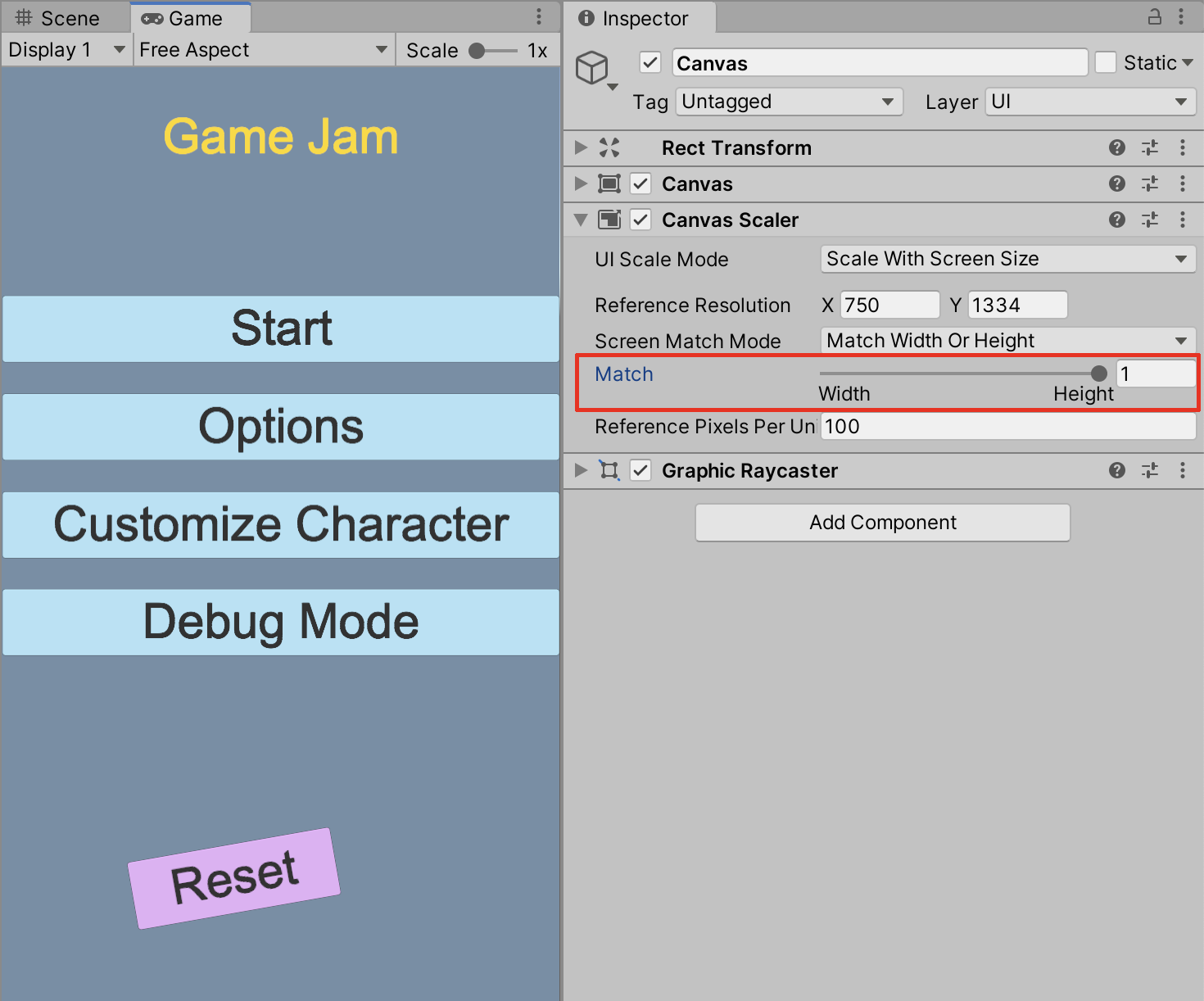
4. Using the Canvas Scaler
The Canvas GameObject is automatically added to the Scene whenever adding a UI element for the first time. Any additional UI elements are added inside the Canvas GameObject. You are able to adjust how the UI elements are scaled using the Canvas Scaler component.
1. With the Canvas GameObject selected in the Hierarchy window, select the triangle to the left of the Canvas Scaler component in the Inspector to expand its properties.
Up until now, whenever you have resized the Game window, the Canvas Scaler component’s UI Scale Mode has been set to Constant Pixel Size. This has been useful in scaling the Game window in the Free Aspect ratio setting. Using the Canvas Scaler, you will specifically target a custom mobile device’s screen resolution.
2. From the UI Scale Mode field’s dropdown, select Scale with Screen Size. Enter custom values in the Reference Resolution X and Y fields. To approximate a mid-sized mobile device’s screen resolution for example, set X=1440, and Y=2960.
When you now resize the Game view window, the UI elements will keep in proportion to the dimensions of the mobile device’s screen width.
3. To match the width or height of the UI elements to keep in proportion to the mobile device’s screen, drag the Match slider. For example, to match the UI elements to the mobile screen’s height resolution, drag the Match slider to Height, or set the value to 1.
5. Next Steps
When using the Anchor and Pivot points with your UI elements, combined with the Canvas Scaler, you are able to customize how UI images will appear on any range of different screen sizes or devices. UI elements such as background images, buttons, and text can be finely tuned and well organized to create professional-quality menus and other user-interface experiences.