
Set up the UI
Tutorial
Beginner
+10XP
30 mins
(84)
Unity Technologies
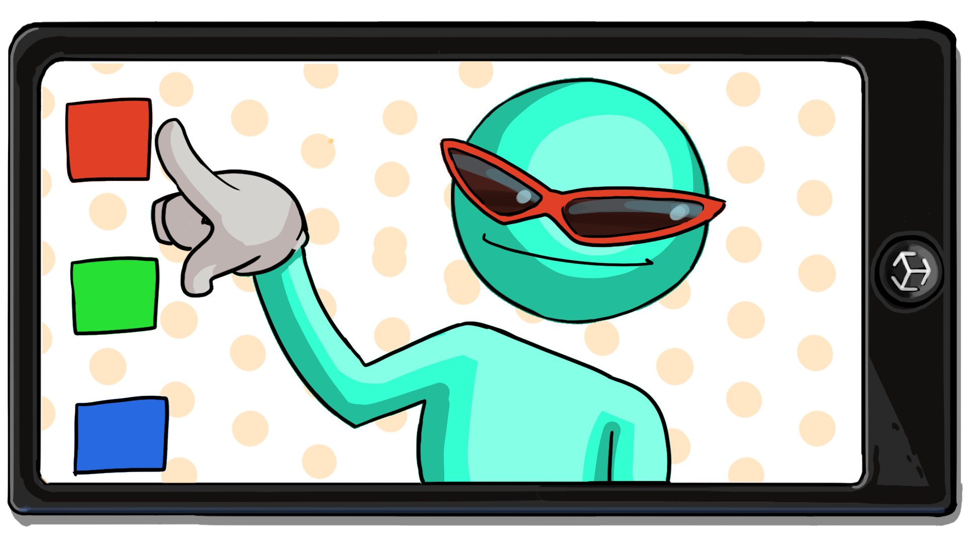
A user interface (UI) allows the user to interact and make selections within your app. In this case, the user will use buttons on the screen to select their pair of glasses and customize the color.
In this tutorial you'll do the following:
- Add default buttons to the screen.
- Customize the appearance of the buttons to suit your specific app.
1. Overview
The app that you’re building will contain two rows of buttons: one for switching between three pairs of glasses, and one for changing the colors of the glasses. In this tutorial, you’ll configure this UI.
2. Add the AR_Canvas prefab
This project uses a UI system called Unity UI (or uGUI). This system organizes user interfaces using a Canvas component — you need to create every part of the user interface as the child of a GameObject with this Canvas component added to it. We’ve already done this for your app, but you’ll need to configure it to suit your specific needs.
Follow these instructions to add the AR_Canvas prefab to your scene:
1. In the Project window, go to Assets > _InteractiveFaceFilter > Prefabs.
2. Drag the AR_Canvas prefab from the Project window into the Hierarchy window.
3. To preview your changes without playing your app, open the Game view.
4. In the Hierarchy window, select the GlassesGroup GameObject and then enable the GameObject in the Inspector window.
The glasses models should appear in the Game view.
The AR_Canvas prefab is rendering (being displayed) as a Screen Space - Overlay UI. This means that the prefab will always render on top of the app camera and appear in precisely the position that it is displayed in the Game view.
5. In the Hierarchy window, expand the AR_Canvas GameObject using the foldout icon to reveal its child GameObjects.
The AR_Canvas is a parent to three GameObjects: Glasses Buttons, Materials Buttons, and EventSystem. The glasses and material button groups are parent GameObjects of the individual buttons you see in the scene. The EventSystem is a GameObject that contains the components that the UI needs to detect user input such as tapping or clicking.
3. Customize the glasses buttons
Currently, the glasses buttons are just blank circles, but in the final app users should be able to tell which button represents which pair of glasses. To accomplish this, you’ll apply pre-made icons that represent each pair of glasses.
The glasses icons were created in external software and grouped together on a sprite sheet. A sprite sheet is an atlas (image containing a collection of smaller images) that can be sliced (separated) and used individually in the Unity Editor. Using a sprite sheet helps to optimize the app: rendering a single image file is more efficient than rendering lots of individual ones. Sprite sheets are also helpful for organizational purposes — you can find all of the glasses icons on the same sprite sheet.
Important: If you created your own pairs of glasses, you will need to create icons for them.
Follow these instructions to customize the glasses buttons:
1. In the Project window, navigate to Assets > _InteractiveFaceFilter > Sprites.
2. Locate the UI_Icon_Glasses sprite sheet and select the arrow on the right side of the thumbnail to reveal the individual sprites.
Note: If the image thumbnails in your project are small or in list format, use the slider at the bottom right of the panel to increase the size.
3. In the Hierarchy window, expand the Glasses Buttons GameObject using the foldout icon to reveal its child GameObjects.
4. Select the Glasses 1 Button GameObject.
5. Choose which of your three chosen glasses for the app will be represented by the first button on the UI.
6. Drag your selected glasses icon from the Project window to the Inspector window, and assign it to the Source Image property.
7. Repeat this process for the remaining two glasses button GameObjects so that each of the pairs of glasses you selected are represented on the UI.
4. Customize the material buttons
In a later tutorial, you’ll create the actual materials that will change the color of the glasses, but for now you have the opportunity to decide what you want those colors to be. Don’t worry if you change your mind later, you can easily come back and update your color selections.
Follow these instructions to change the button colors:
1. In the Hierarchy window, select the dropdown arrow next to Materials Buttons to reveal its child GameObjects.
2. Select the Material 1 Button GameObject.
3. In the Inspector window, go to the Image component and select the Color property picker.
4. Choose a color for the first button.
5. Repeat this process for the remaining two material buttons.
6. Save your scene.
5. More to try
If you want to further develop your skills, explore new concepts, or improve your project, check out some of the optional activities below. Each one is tagged as either Medium or Difficult, so you can choose the level of challenge.
These activities are entirely optional, so if you’re not interested, no problem – just skip this step. We do recommend attempting at least one of them in order to get the most out of this learning experience. Good luck!
Medium: Edit the UI Layout
Moving some buttons to a different location on the UI can make it easier for your user to press those buttons or make it less likely the buttons will cover parts of your filter that have specific effects. Try moving either your color buttons or your glasses buttons to the top of the screen. To do this you will need to modify the Rect Transform component of the icon group in order to move it to an appropriate location on the screen.
To help you with this, Creative Core: UI has many useful tutorials you may want to explore!
Difficult: Create new glasses icons
If you created your own pairs of glasses you’ll need to create icons to represent them on the UI. We’ve provided a PSD file called UI_Icon_Glasses_Template containing the glasses sprite sheet, as well as a PNG version if you’re unable to use PSD files. Both files contain the sprite sheet as it appears in Unity.
Follow these instructions to edit the sprite sheet in your image editor of choice and import your new icons into Unity:
1. In the Project window, navigate to Assets > _InteractiveFaceFilter > Resources.
2. Right-click the file format of your choice and then select Show in Explorer (macOS: Reveal in Finder). A window will open and show you where the file is located in the project.
3. Double-click your PSD or PNG file to open it in your image editor of choice.
The PSD file has each of the different glasses icons sorted into their own grouped folders in the layers palette. At the bottom of the list is an Empty Circle group. You can use this group to create your own glasses icon. If you made more than one pair of glasses, replace one of the glasses icons you won’t be using in your app with your own designs.
Warning: Do not move the icons! They’re laid out in a specific format so Unity can cut them into individual sprites.
To create your own image icons, you can either draw the glasses or take a screenshot or render of the glasses that you modeled in your 3D modeling software and add that to the PSD file. The dark outlines around the icons are an image effect that can be copied onto your own layers.
4. When you’ve finished editing the icons, disable the white layer at the bottom of the layers palette.
5. In your 3D modeling software, go to the main menu and select Save As.
6. Navigate to where you’ve saved your Unity project and find the Sprites folder. The path should look like this: [Your unity project]\Assets\_InteractiveFaceFilter\Sprites.
7. Select the UI_Icon_Glasses.png file and select Save.
8. When you are prompted to overwrite the saved file, select Yes.
9. Return to the Unity Editor and look in the Sprites folder to find your updated file.
6. Next steps
In this tutorial you added the app UI and customized it to suit your specific needs. You’ve now created all of the visual assets for your app and are ready to move on to its core functionality. In the next tutorial, you’ll create your first visual script to detect when a button has been pressed.